Monday, June 29, 2015

FAMOUS PHOTOGRAPHERS - HOW AND WHY THEY PHOTOGRAPH


The Leica Camera Blog, http://blog.leica-camera.com, some time ago had a very interesting account of the thoughts of some rather famous photographers about their photography and photography in general.

They wrote: In Chapter 4 of my Leica Notebook, I wrote about comments from photographers and how and why they photograph.  I believe if we pay attention to the thoughts of these photographers, we will discover that the lessons they have learned as photographers do not only apply to photography.  There is a deeper message they are sharing with us about how we decide to live our life.


W. Eugene Smith said, “Passion is in all great searches and is necessary to all creative endeavors – whether statesman, or scientist, or artist or freedom or devil . . . Question this. Take note of the values around you, everywhere thrust upon you and wait awhile with this question in thought”. His personal, philosophical concern was “I try to give what voice I have and give it to those who don’t have one at all”.


Robert Frank said, “Above all, I know that life for a photographer cannot be a matter of indifference . . . it is important to see what is invisible to others.  Also, it is always the instantaneous reaction to oneself that produces a photograph. It is wonderful to look, to understand what you look at and to be sympathetic at what you look at.  This is a thing a photographer trains himself to be.  You don’t learn this in a school.  This is about life. You use your eyes and you don’t get tired of looking . . . I’m still looking”.  In an interview he said, “I’m still taking pictures; I thought there might be some more pictures inside the little camera, the Leica. Keep your eyes open and try to think.  It is your friend, the camera.  It is wonderful for your mind”. His aim, he said, was trying to tell something which was true.


Lisette Model’s advice to photographers was to never take a photograph unless it hits you in the pit of your stomach.  To be a good photographer depends on how much effort she is willing to expend in achieving whatever goal in life she sets for herself. Lisette said, “When a photographer is in contact with his life and in contact with himself, that is, understands himself for what he really is, then he can use the medium creatively.  A photograph should be concerned with everything in life that is meaningful for us today”.


Duane Michals, in his advice to young photographers, tells them not to try to be an artist:  “Limit yourself to doing your work, and if the work is true and authentic, it will become art. But you have to feel it. Pay attention to your mind, find your energy; you have to make it happen. You are. Risk goes with the creative act, do what you have to do, living in a state of wakeful dreaming. Find out who you are. Be brave. If you don’t ask, you don’t get”. Duane Michals wants you to feel, touch, become aware.  He also said, “How you express what you care about validates your own feeling . . . you must really care”!


Cornell Capa’s exhibition in 1968 at the Riverside Church in New York City was accompanied by a publication which was also the title of the exhibition, “The Concerned Photographer”.  It featured the photographs of six photographers: Andre Kertesz, Robert Capa, Werner Bischof, David Seymour (Chim), Leonard Freed, and Dan Wiener. This was the beginning of Cornell Capa’s passionate mission.  In 1972, Cornell Capa founded The International Center of Photography. It was dedicated to photography which demands personal commitment and concern for mankind. It was the center for students of photography and exhibitions of “concerned” photographers. Cornell Capa, the concerned photographer, had the desire and plan to better humanity through photography. He created a place where photography became an important instrument in developing public awareness of the problems in our world.


Yousuf Karsh was fascinated by the people he photographed. He said, “For me, lies in what I call their inward power.  It is part of the elusive secret that hides in everyone and it has been my life’s work to capture it on film. The mask we present to others and too often to ourselves may lift for only one second to reveal the power in an unconscious gesture etc. This is the moment to record”. He repeats that the heart and the mind are the true lens of the camera.


My interview with Leonard Freed still resonates with me. He said, “The advice I would give young photographers is there is no substitute for work.  What I want to say is in my head, not in the camera . . . What I am seeing everybody sees, but you have to respond to it”. Photography is a visual language.  Just as a poet adds meaning to words, so the photographer adds to visual symbols.

Edward Steichen

“The mission of photography is to explain man to man and each man to himself” –Edward Steichen


To comment or to read comments please scroll past the ads below.

-------------------------------------------------------------------------------------------------------------------------------------------

-----------------------------------------------------------------------------------------------------------------------------------------------------------------------------------------------------------------

For more information on KOMARU and for orders go to: www.taos-photographic.com
-----------------------------------------------------------------------------------------------------------------------------------------------------------------------------------------------------------------

For more information and pre orders go to: www.lenstab.com
--------------------------------------------------------------------------------------------------------------------------------------------------------------------------------------------------------------------------------------------------------------------------------------


Leica Akademie Chicago with Craig Semetko - August 2015


This Friday - Limbo by Nicholas Pinto
-----------------------------------------------------------------------------------------------------------------------------------------------------------------------------------------------------------------

Inventive Camera Bags for All of Your Gear
Receive a FREE CAMERA BAG from Think Tank Photo

-----------------------------------------------------------------------------------------------------------------------------------------------------------------------------------------------------------------

Click on image to enlarge
Please make payment via PayPal to GMP Photography

Click on image to enlarge
Please make payment via PayPal to GMP Photography


Click on image to enlarge
Please make payment via PayPal to GMP Photography


Thursday, June 25, 2015

ENLARGEMENTS FROM NEGATIVES - A DIFFERENT APPROACH TO FIXING


As small as Leica is as a company when compared to the Canons and Nikons of the industry, they remain as a major player in the manufacture of 35mm film cameras.  Many loyal customers remain that have not totally succumbed to the siren song of digital photography and many of them still enjoy making their own prints in a good old fashioned darkroom instead of a digital printer.

A very important part of analog photography is to properly fix out prints and enlargements.  Old photographic wisdom tells us that we have to use a two bath fixer to make black & white photographs last.  This is accompanied by lengthy washing to allow all traces of fixer to be removed.  While any of this does not present any nominal problems with resin coated papers, sufficient fixing and washing does become more problematic with fiber base papers.  Washing times of one or more hours are not unusual.  A lot of darkroom enthusiasts shy away from fiber base papers because of the lengthy developing process.  This brings up the request of viable alternatives.

Image scanned from an enlargement on Agfa Portriga Rapid,
fixed with the method described in the article

In an article by Ralph Steiner, published by the Graphic Arts Research Center at RIT (Rochester Institute of Technology), he offered such an alternative.  This method was further researched, and verified by Ilford.

Both research papers suggest to replace standard fixers with fast working fixers like Kodak Rapid Fix.  Further more, it is suggested to use these fixers at film strength.  Mr. Steiner states that sufficient fixing is achieved within only thirty seconds.  This is then accompanied by a wash of only 5 to 10 minutes with fiber base papers.

After a five minute wash, a FASTFIX leaves one tenth as much hypo as does the standard Kodak fixing advise.  And a FASTFIX print which is washed five minutes has in it one fourth as much hypo as a LONGFIXED print which was washed thirty minutes.

Since film strength rapid fix achieves sufficient fixing in only 30 seconds, the paper is submerged only very briefly, leaving the fixer little time to soak into the fibers of the paper.  Subsequently, only a short wash time is necessary to remove these fixer traces from the paper.  Mr. Steiner writes:


Should you think to compensate for your LONGFIXING by LONGWASHING, just give up on that idea.  I tried washing a LONGFIXED print for two days!  In two days of washing I finally got a LONGFIXED print down to around the residual hypo of a FASTFIXED print which had twelve minutes washing.  Both washings were uncrowded and thorough.


To comment or to read comments please scroll past the ads below.

-------------------------------------------------------------------------------------------------------------------------------------------

-----------------------------------------------------------------------------------------------------------------------------------------------------------------------------------------------------------------

For more information on KOMARU and for orders go to: www.taos-photographic.com
-----------------------------------------------------------------------------------------------------------------------------------------------------------------------------------------------------------------

For more information and pre orders go to: www.lenstab.com
--------------------------------------------------------------------------------------------------------------------------------------------------------------------------------------------------------------------------------------------------------------------------------------


Leica Akademie Chicago with Craig Semetko - August 2015


Upcoming shows in Tamarkin's Rangefinder Gallery

-----------------------------------------------------------------------------------------------------------------------------------------------------------------------------------------------------------------

Inventive Camera Bags for All of Your Gear
Receive a FREE CAMERA BAG from Think Tank Photo

-----------------------------------------------------------------------------------------------------------------------------------------------------------------------------------------------------------------

Click on image to enlarge
Please make payment via PayPal to GMP Photography

Click on image to enlarge
Please make payment via PayPal to GMP Photography


Click on image to enlarge
Please make payment via PayPal to GMP Photography


Sunday, June 21, 2015

COMPOSITION


Volumes have been written about this topic and probably without exception, it is always mentioned that there are really no rules that are carved in stone.  What we do have is a number of guidelines, all designed to help us create better pictures.  However, these should not be looked upon as a replacement for visually evaluating whatever we try to photograph.  What we see in the viewfinder of our cameras remains as important as ever.  One piece of advice that I always give is “if it looks good, shoot it.”

Some individuals intuitively use good composition and end up with good pictures.  For them the guidelines of composition will turn into an explanation of why their pictures look good.  For the majority, however, these guidelines will help to create better pictures by simply evaluating what is seen in the viewfinder, applying some of these guidelines and thus end up with better pictures than what otherwise might have been the case.

It is not the purpose of this article to touch on each and every one of these rules.  Instead I will concentrate on just the most important ones in order to keep this from getting too tedious.

Of all these guidelines, without question the most useful one is the rule of thirds.  Here we divide the image seen in the viewfinder by two evenly spaced vertical and horizontal lines.  This will help composition in a variety of ways.  Not only does it  lead to better placement of the main object of the picture, it also suggests better placement of the horizon as well as placement of other important aspects of the picture.


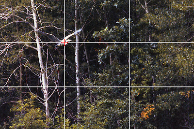
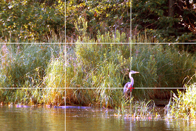
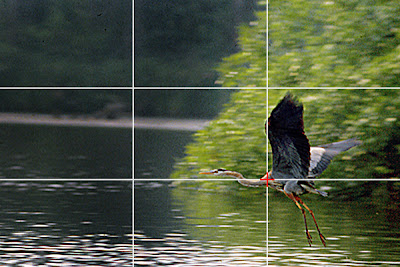
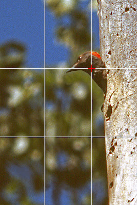
In these four examples I used the rule of thirds by placing the main subject onto one of the four areas where the horizontal and vertical lines intersect.  Especial with cameras where the autofocus sensor is in the center of the viewfinder, it is almost intuitive to place the main subject in the center.  That usually has the result of the picture looking somewhat static.  Applying the rule of thirds usually will lead to a noticeable improvement of the picture.

Of course, this brings up the question which of the four intersection point to place the subject on.  In the first example, the upper left intersection point is most advantageous in order to emphasize the height of the flying bird.  In addition, it is usually better to place a moving subject such that it appears to be moving into the picture, with space in front to move towards.

For the second example there is no clear advantage of one over the other.  Here it is simply a matter of what one feels looks best.

The third example is similar to the first one, again leaving room in front of the bird to move towards.  I chose the lower right intersection point since the bird just took off, flying low across the surface of the water.

The fourth example was taken from a low vantage point, leading to an upward camera angle.  Therefore the picture looks better with the bird up high in the picture with space in front of the bird.  The upper right intersecting point is the best choice in this case.


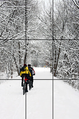
Another aspect of good composition is lines and diagonals.  They help to lead the eye toward the subject and into the picture.  The path in this photograph shows strong lines.  The main subject was best placed on the lower left intersection point because this way the lines lead to the impression of the bikers moving forward and into the picture.


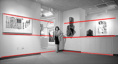
Even though placing the subject into the center of the picture usually will lead to a static looking image, there are times when this is actually advantageous, as in this case.  The picture contains some very strong lines which all lead the eye toward the main subject.  Utilizing these lines actually made for a better picture by placing the subject into the center. 

Another aspect of the composition of this picture is the cropping.  Some photographs simply look better when cropped from the typical format of the camera.  The horizontal emphasis  of this picture by cropping the top and the bottom further enhance the subject position within the picture.


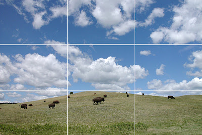
The horizontal and vertical lines of the rule of thirds also give an indication of proper placement of strong verticals or horizontals within the picture, like the horizon in this case.  The lower horizontal is advantageous because it not only eliminated empty grass space in front of the buffaloes it also allowed to take advantage of the marvelous clouds and blue sky.


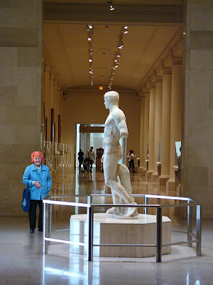
This example combines several aspects of good composition.  The strong diagonal lines of the background lead to the main subject, the statue, in the center.  In addition, the columns create a strong pattern which is another element of composition.  Finally, the lady viewing the statue creates a second important viewpoint of the picture.  The placement on the lower left intersecting point very much adds to the composition, as do the strong colors in the otherwise subdued colors of the picture, especially the bright, red hair.


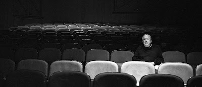
This is another example of strong subject placement, in this case on the right vertical line.  The picture would have had a lot less impact had the subject been placed in the center.  In addition the picture is further enhanced by the cropping and the pattern of the seats in both the foreground and especially the background.


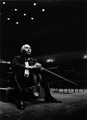
Placing the subject on the lower left intersecting point emphasized the upward camera angle without allowing it to appear distant as it would have been the case had it been placed on the upper left intersection point.  In addition, the mostly black background creates a lot of so called dead space.  This is often preferable over background detail which would be distracting.  Finally, the violin bow is a strong line, leading to the main subject of the picture.


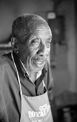
In portraits it is generally preferable to have more space in front of the face than in back.  Choosing to place the subject in the left vertical of the rule of thirds assured proper subject placement in this case.


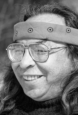
There are, however, times when the rule of thirds does not apply, as in this case.  The strong face of the person in this picture was emphasized by the close up of it.  Since it fills the entire frame, there was no other choice than to center it.  Anything else would have been distracting.


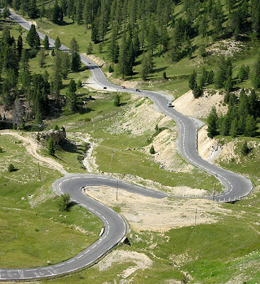
Another element of good composition are curves or s-lines.  As in this example, they are an interesting element of the picture that helps to lead the eye into the picture.


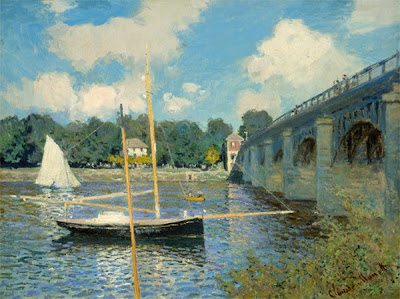
Of course, these elements of good composition don’t apply just to photography.  They have been applied by the great masters for years, just as in this case of the painting “The Bridge At Argenteuil” by Claude Monet.  It contains numerous elements of good composition.   The bridge shows several strong lines, including a pattern created by the upright pillars and it also leads the eye toward the background.    The sailboat in the foreground is placed in the lower left intersection point of the rule of thirds.  The mast the boom and the bow sprit of the boat also form very strong lines.  The combination of all of these elements of good composition ultimately make for a very interesting picture.


There are certainly additional rules of composition.  As mentioned above, to keep this article from becoming too long and possibly too confusing, I tried to concentrate on the most useful ones here.  Applying these when possible or warranted will lead to better pictures and over time, photographers will get used to it to the extent that these rules and their application will become second nature.  At that point, we have bridged the difference between just taking pictures and creating photographs.


To comment or to read comments please scroll past the ads below.

-------------------------------------------------------------------------------------------------------------------------------------------

-----------------------------------------------------------------------------------------------------------------------------------------------------------------------------------------------------------------

For more information on KOMARU and for orders go to: www.taos-photographic.com
-----------------------------------------------------------------------------------------------------------------------------------------------------------------------------------------------------------------

For more information and pre orders go to: www.lenstab.com
--------------------------------------------------------------------------------------------------------------------------------------------------------------------------------------------------------------------------------------------------------------------------------------


Leica Akademie Chicago with Craig Semetko - August 2015


Upcoming shows in Tamarkin's Rangefinder Gallery

-----------------------------------------------------------------------------------------------------------------------------------------------------------------------------------------------------------------

Inventive Camera Bags for All of Your Gear
Receive a FREE CAMERA BAG from Think Tank Photo

-----------------------------------------------------------------------------------------------------------------------------------------------------------------------------------------------------------------

Click on image to enlarge
Please make payment via PayPal to GMP Photography

Click on image to enlarge
Please make payment via PayPal to GMP Photography


Click on image to enlarge
Please make payment via PayPal to GMP Photography