
By David Farkas, Leica Store Miami
I’ve taken advantage of Develop Presets when importing and processing my Leica DNG files since switching to Adobe Lightroom in 2009. Presets aren’t complicated. They are simply a saved set of instructions, a recipe of sorts. When you select a preset in the Develop module, this recipe of adjustments will be applied to a single file. Or, if you want to harness their true power, have Lightroom automatically apply to all files during the Import process. And while the main advantage is to offload all the repetitive work for you, a notable and welcome benefit is that once imported, all the images will have your preferred treatment, even before touching a single slider. This makes the selecting and editing process much more streamlined and efficient. Ultimately, incorporating presets into your Lightroom workflow can be a massive time saver.
Now before we get too far along, I do want to clarify that these presets are designed to work with Adobe Lightroom Classic CC, which is the latest version. I have not tested them with Lightroom CC, which is more of a light version, or with Lightroom Mobile. Also, older non-CC standalone versions may not work with the newer XML file type.
But aren’t Leica files out of camera amazing? Why would I need to change anything?
Let’s dispense with the myth. There is no such thing as “Out of Camera,” unless you are shooting JPG. If you shoot in any RAW format, be it DNG for Leica files, or otherwise, OOC simply doesn’t exist. The default rendering of an image depends on a multitude of variables, like how a program handles the de-Bayering algorithm, which camera profile is used, and whatever default adjustments Lightroom pre-applies. And honestly, I don’t think it matters anyway.
For my own workflow, I’ve created presets for each Leica camera that I shoot with. The desired result isn’t necessarily accurate but is pleasing to my eye. My goal is to create what I refer to as “the best version of reality.” Look, I don’t want a flat and dull image, nor do I care for an over-processed, artificial-looking mess. And truthfully, this balancing act isn’t always easy. With digital capture and the ever-improving capabilities of the sensors, the possibilities for post processing are almost limitless. Just like in cooking, sometimes “just a pinch” is all you need to elevate the final product.
Not out of camera, but rather the best version of reality
Leica S (Typ 007) with 45mm Elmarit-S ASPH
What’s in the presets?
My goal is to offload the settings that I always change, for every image, for a given camera. At a bare minimum, we’re talking about camera profile, sharpening, lens corrections, basic tone and presence. Past that, if I see some color weirdness, I might input small tweaks in the HSL/Color (Hue/Saturation/Lightness) panel. There’s no magic here, just a set of saved adjustments.
As I start using a new camera model, I will generally adapt a previous preset from a similar camera. When the SL2 came out, I started with my SL (Typ 601) preset as a starting point. For my first Leica CL images, I turned to the TL2 for guidance. And this is because a lot of the base adjustments are similar.
Will these presets do everything?
No. Every image is unique and as such will require individual attention. Also, the preset will not adjust exposure or white balance. So, before anything else, you’ll want to get these basic settings dialed in. After that, usually small adjustments to the highlight and shadow slider will get most images looking good. For challenging, high contrast images, you might have to dive into local adjustments like the Gradient tool or the Local Adjustment Brush, but at least you’ll have a solid foundation of enhancements to build off. Here’s an example of my workflow.
Let’s start with the default Lightroom treatment of an SL (Typ 601) shot I took in Iceland this past August. Some might call this out of camera, but that’s not an accurate description as we already discussed. Clearly, the exposure is correct and the white balance seems decent enough, but the image is flat.
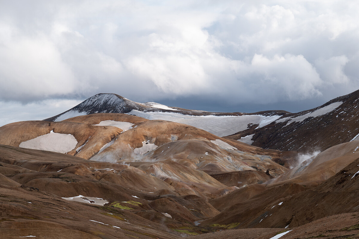
Leica SL (Typ 601) image with default settings in Lightroom
Now, let’s see what happens when I simply apply my SL601 preset. Immediately, the image comes to life. All of the correct sharpening and basic toning is set. We could stop here, but really, this is just a starting point.
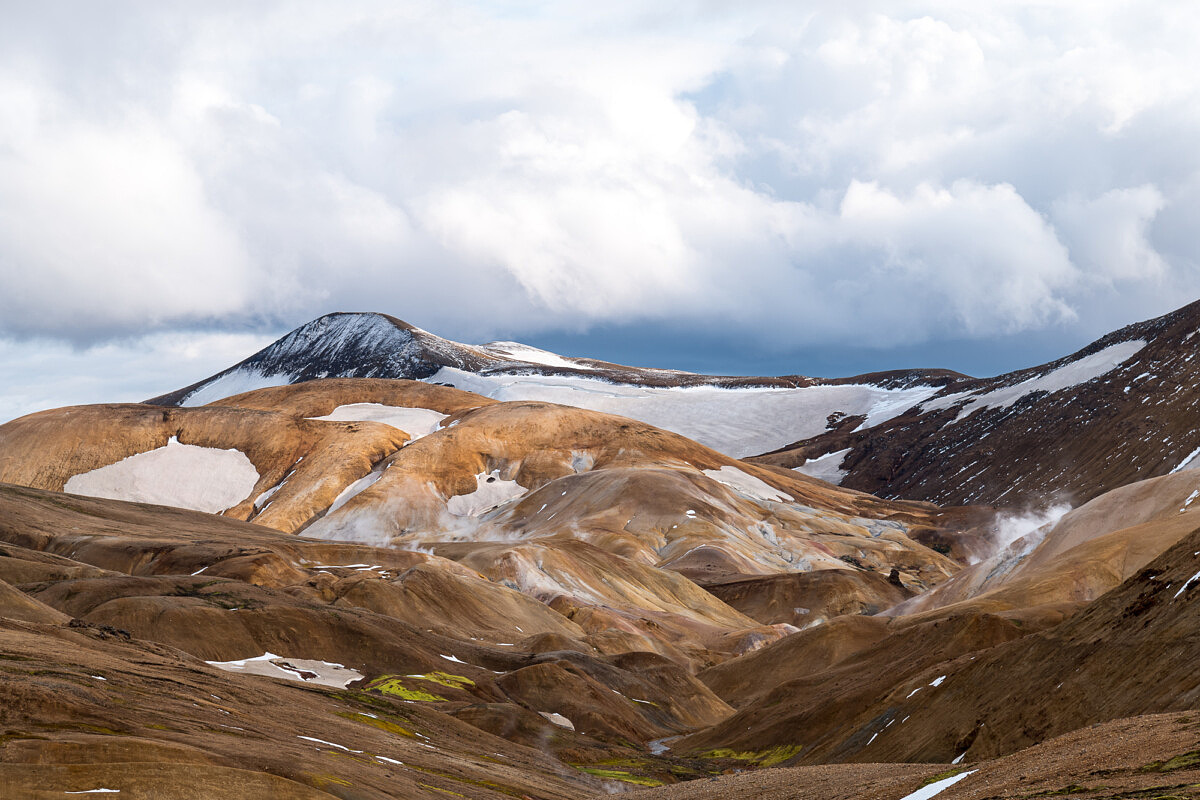
Leica SL (Typ 601) image with my preset applied
With the preset laying the foundation, we can now fine-tune the image to its finished treatment. Here, I adjusted the basic tone and presence sliders, along with a small tweak to the white balance. So, with just a few seconds of work, we now have a finished image, ready for print or web output.
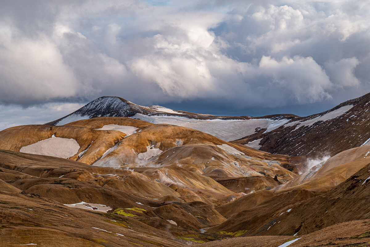
Finished Leica SL (Typ 601) image after fine-tuning tone and presence sliders
Alright, so now that you have an idea of what the presets are and why I use them, let’s briefly discuss what they are actually changing in Lightroom.
Camera Profile
I like to relate camera profiles to film. When used in the same camera, no two films types, not even those from a single manufacturer, produce the same rendering. While Kodak Portra is quite different than Kodak Ektar, the disparity between Fuji Velvia and Kodachrome can be much more extreme. So, at the most basic level, think about the various built-in camera profiles in Lightroom as different film types. Adobe Standard will act more like Ektachrome while Adobe Landscape might be akin to Velvia. But this only tells the beginning of the story, as the camera profile is just one variable in the overall Lightroom mix.
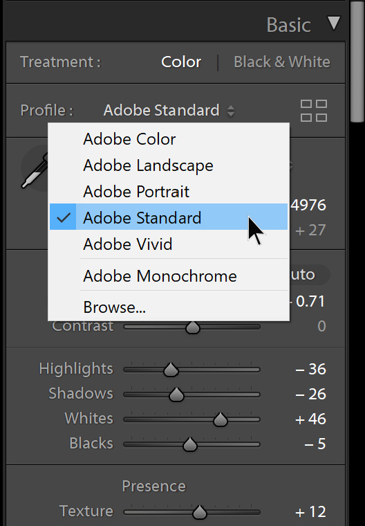
I tend to favor Adobe Standard as a starting point for most of my Leica presets. Fairly neutral and vanilla without being too flat, it provides a workable foundation to build the rest of the preset onto. One of the frustrations in most of my camera reviews is that there are no official profiles at the time I’m processing my test images. This leaves Embedded as the only option, which frankly isn’t great. The colors are usually off in weird ways. The noise isn’t optimized, and file malleability is limited. When Adobe releases their camera support with proper profiles, I often see massive jumps in final image quality. So, yeah, best to stay away from Embedded if it’s an option. Try out the other profiles and see how they impact the overall look of the image, then figure out what you prefer.
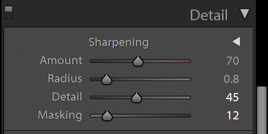
Sharpening
Time to dispel another common misconception and simplify your workflow. I sharpen per camera, not per image. Heresy? Nope. Here’s my reasoning. From a technical standpoint, you’ve either taken a sharp image or you haven’t. Look, no amount of post processing sharpening is going to fix motion blur or missed focus. My main objective is to sharpen for the behavior of the sensor and assume that all images are technically sharp. We’re simply trying to enhance and bring out the detail that is already in the file. Also, with Leica digital sensors, there are no anti-aliasing filters to blur the image. So, this makes our job a little easier. I don’t want to get into the specifics of my particular tastes in sharpening, but my advice is to not overdo it. Nor should you leave the sharpening settings at default.
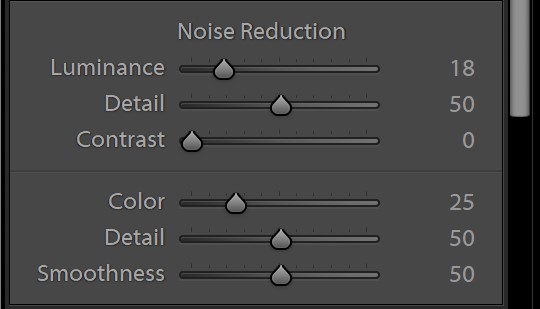
Noise Reduction
My presets apply a generic amount of noise reduction for each camera. Clearly, one setting isn’t going to work equally well for ISO 100 and ISO 10,000. For the lower ISO, you’ll want less noise reduction to retain as much detail as possible, and additional noise reduction for very high ISO images in order to create smoother final results. I’m afraid that you’ll just have to adjust this one by eye for very high ISO shots.
Now, there actually is a way to create ISO-dependent presets, but unfortunately not within Lightroom. Nope. The only way to set these up is by editing the XML code of the preset, and frankly I haven’t taken the time to determine all the best settings at every ISO for every camera then code them into the files. If you are so inclined, check out Adobe’s technical article on how to do it here.
Lens Corrections
This one is easy nowadays. Just make sure the Auto checkbox is ticked and Lightroom will apply the appropriate lens corrections based either on 6-bit coding data from M cameras, S lens data from S cameras, or embedded profiles for SL, Q and TL lenses. Here, you can see the behavior for an M10 with an APO-Suumicron-M 50mm ASPH mounted, then an SL2 with a 24-90mm SL below. For the SL2, everything is grayed out and the message “Built-in Lens Profile applied” is displayed.
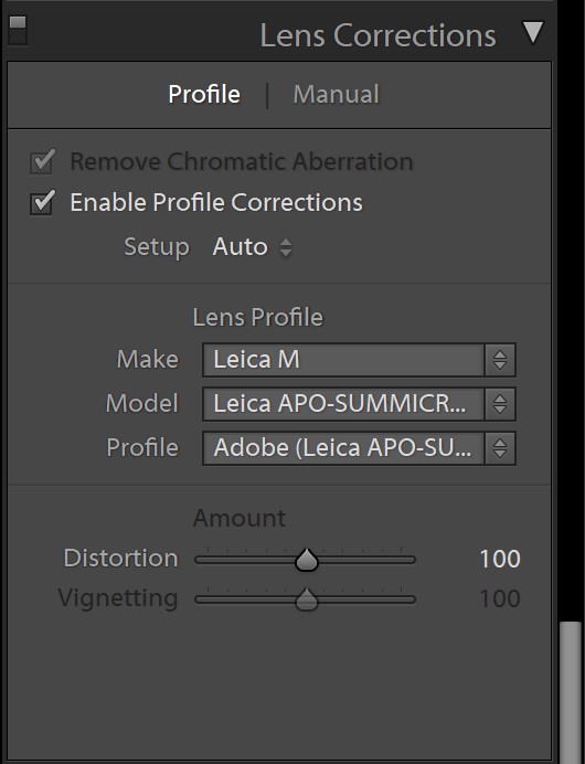
Lens profile behavior for M10 with 50mm APO-Summicron
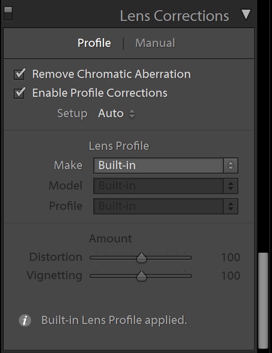
Lens profile behavior with SL2 and 24-90mm
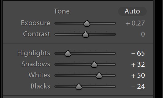
Tone
This is where I do most of my work in Lightroom, even after applying a preset. And if you use my presets, you’ll see I stick to a rough formula, varying by camera. I like punchy highlight and shadow contrast, but without sacrificing highlight and shadow detail or blowing out any image information. My best results come from bringing down the highlights while bumping the whites and pulling up the shadows while dropping the blacks. The end result has punch while also expanding the histogram.
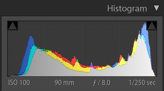
Here’s what I mean about the histogram. Using the same shot from the Icelandic Highlands, you can see the first histogram is the default behavior in Lightroom. And it’s fine. Properly exposed with a decent amount of midtone information.
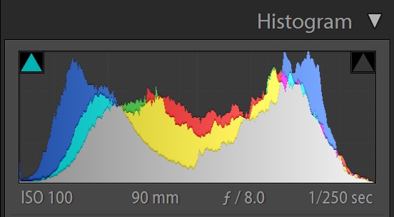
And this is the histogram from the finished image after preset and final adjustments. The total volume has increased, especially in the midtone areas and darker shadows, while also controlling some of the very bright highlights.
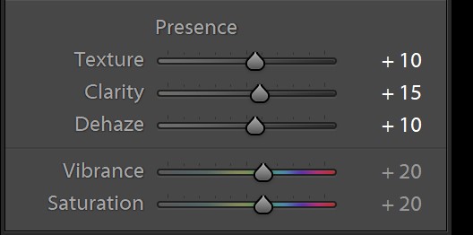
Presence
Here we’ve got Texture, Clarity and Dehaze, along with Vibrance and Saturation. These tools’ performance and my corresponding approach towards using them have changed significantly over time. At first, I avoided Dehaze like the plague as it could quickly wreak havoc on an otherwise nice image. Now, I find with Adobe’s continued development, the control is now a welcome addition to my own processing when used in moderation. And the same goes for Clarity and Texture, with both useful, but often overdone. And some older CCD-based system, like the S2 and M9 still don’t respond favorably with additional clarity.
Retina-style screens
And on that note, a quick word of warning for those using Retina-style screens, which means any and all MacBook Pros and iMacs, along with a bunch of PC hardware too. Due to the nature of pixel doubling on high res displays, images seem to be able to take enormous amounts of these Presence adjustments. But, when output as prints, or viewed on a non-scaled display, the results can often be catastrophic. I’m a huge proponent of editing on non-scaled displays for critical work. And that generally means going big. My main editing screen is an LG 34” ultrawide at 3440×1440 pixels with no scaling. One pixel on screen is one pixel in my original image at 1:1 size. I’m planning to move up to double ProArt 32” 4K displays, again with no scaling.
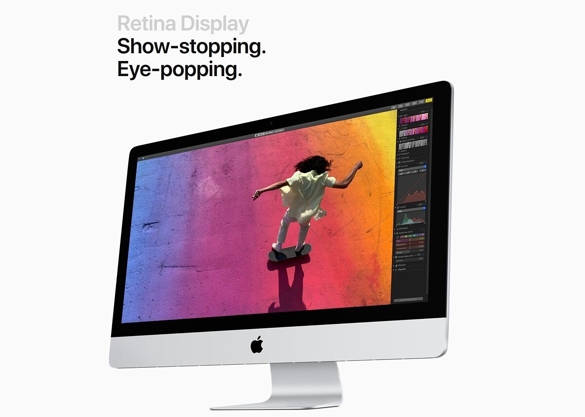
Show-stopping and eye-popping, sure, but not always the best for critical editing
Smaller, 27” displays like the one in the 5K iMac look amazing for text and images but are too pixel-dense to run at 1:1. The text and UI elements would be unreadable. If you have no intention of changing your whole editing setup, or simply don’t have a choice when editing with a laptop on the go, my suggestion is to adhere to self-imposed limits on these controls, based on numbers. A good rule of thumb is to keep any of these sliders under 20, unless you are pushing past for purely artistic reasons. With Dehaze, a max of 10 might even be more prudent.
And this follows suit on the Vibrance and Saturation adjustments. Vibrance will impact less saturated colors like skin tones, while Saturation changes deeper colors. A touch of both will generally help an image, with landscapes benefiting most. For portraits, you may want to dial back a bit.
HSL/Color
The last module to discuss is HSL/Color, which stands for Hue/Saturation/Lightness. Here, you can fine-tune the behavior of eight different colors. The colors are a mix of additive and subtractive color wheels’ primary and secondary colors, and cover most of the main colors in photographic images. While not as comprehensive as something like the Hue vs. Hue controls in DaVinci Resolve or Adobe Premiere’s Lumetri color grading module, this implementation is far simpler to use. If you prefer bluer skies without oversaturating the entire image, bump up the blue saturation slider. Skin tones a little too reddish. A small tweak of the red hue slider will make the reds more orangish. A little goes a long way. Don’t overdo it. In fact, for most of my presets, I don’t even touch these settings.
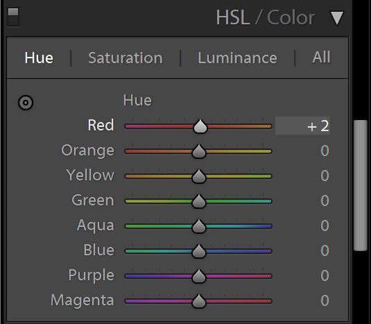
A small tweak of the red channel to make reds more orange and less magenta
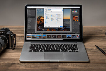
How do I import and use the presets?
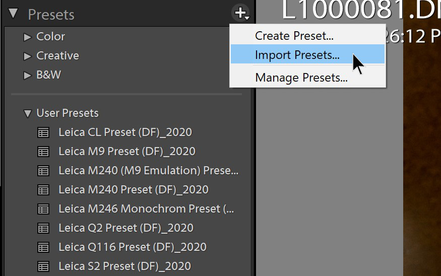
Once you download the presets to your computer using the links below, make sure you note the file location. Open up Lightroom and switch to the Develop module (either just press D on your keyboard or select it from the top navigation bar). On the left panel, look for Presets. Click the + symbol and select Import Presets… Navigate to the location on your computer where you downloaded the presets and select. The presets will now show under the User Presets dropdown. No restart is required.
To use, simply go to a file in your catalog, switch to Develop and click the preset once. Just be aware that all of your previous adjustments will be overwritten with those from the preset.
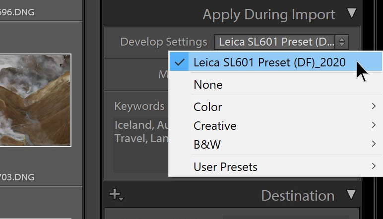
But, as I stated, the true power will be using the appropriate preset during the import process with a large batch of files. In the Import dialog, on the right panel, expand the Apply During Import tab. Here, you’ll see a dropdown labeled Develop Settings. Click the dropdown, go to the bottom of the list, hover over User Presets and you should see all your imported, or created, presets. Select the correct one for the corresponding camera and import as normal. This will apply the develop preset to each file during import.
Now, if you want to things to the next level, you can even automate which preset Lightroom will apply on import on a per-camera basis. Got to Preferences -> Presets and assign a default processing for each camera type in your catalog, restart Lightroom and the next time you import, you’re good to go.
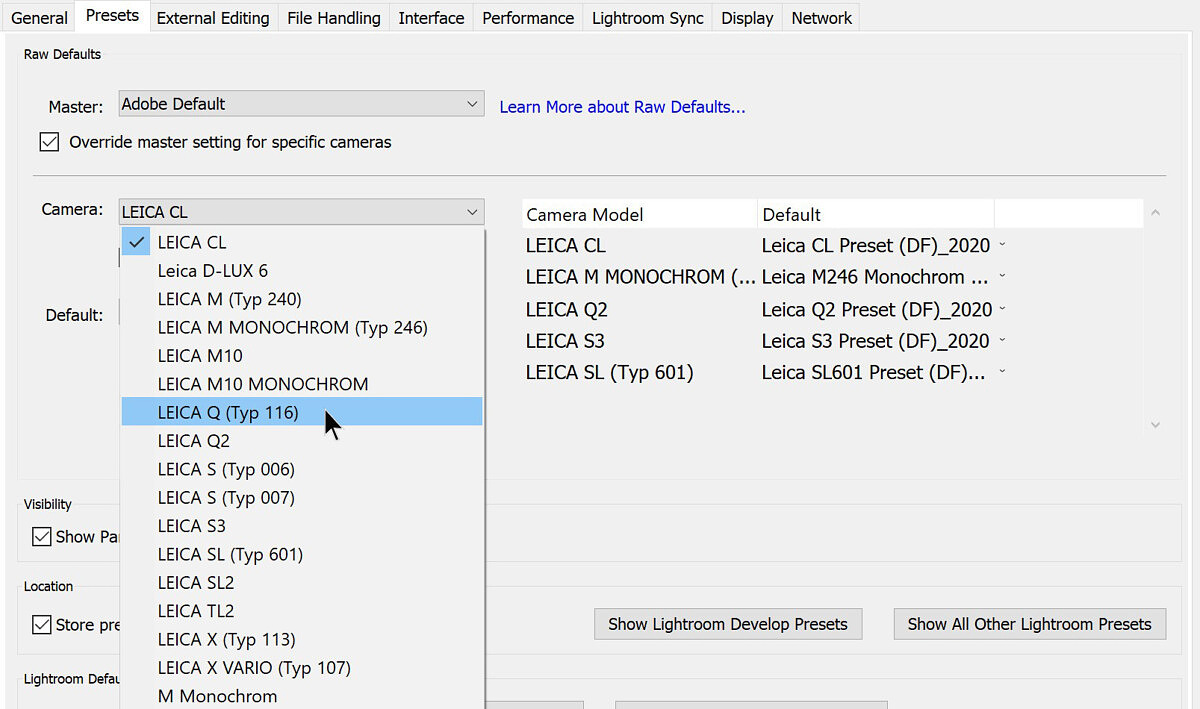
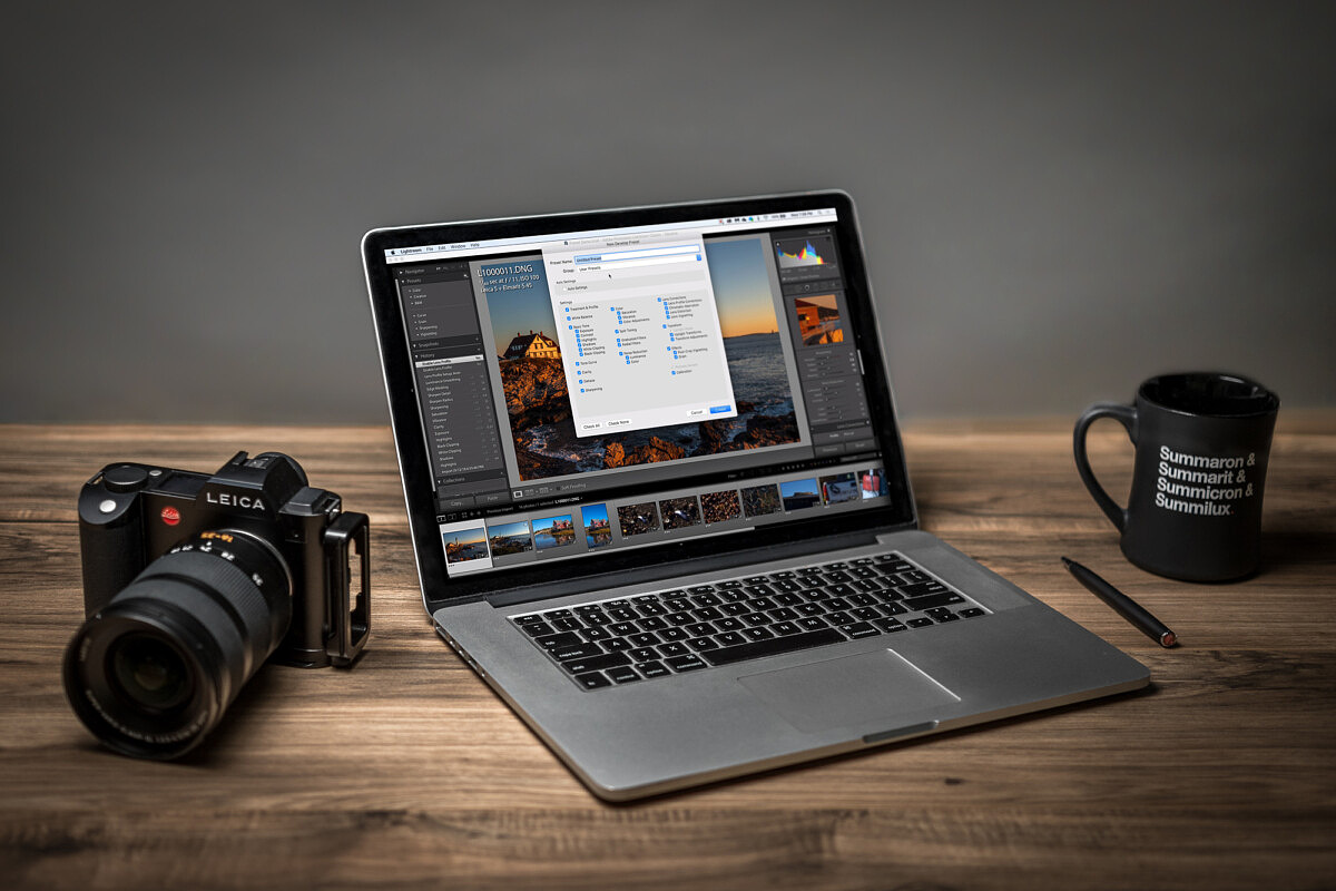
First, select the camera
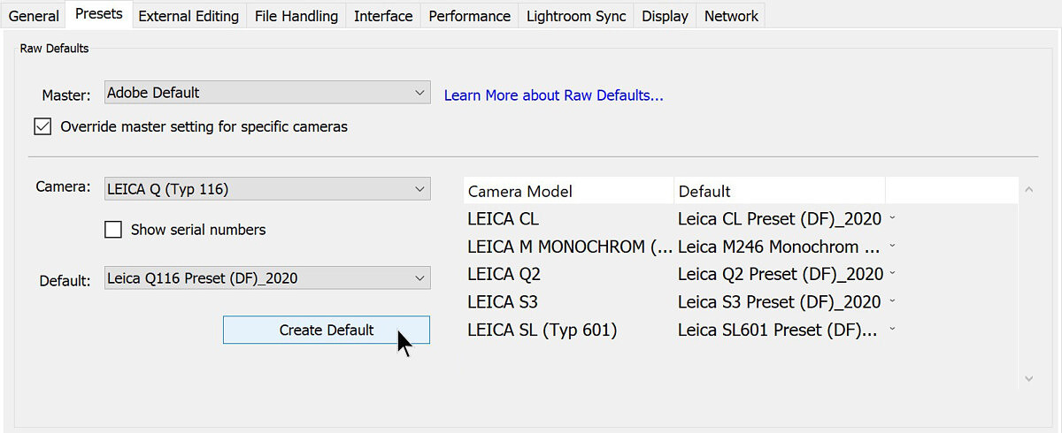
From the Default dropdown, select the correct preset then click Create Default
What if I don’t like the presets?
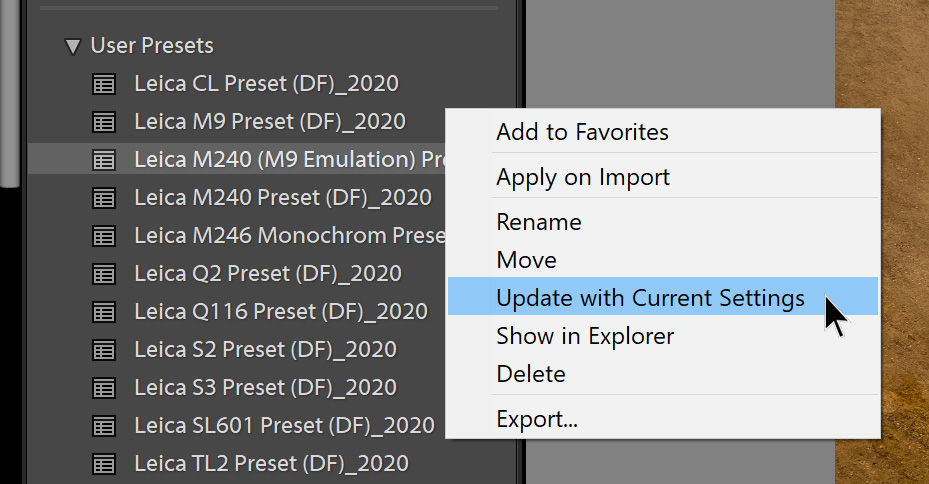
You may not like how I’ve chosen to bias my images. And that’s totally fine. Photography is a very personalized craft. Every photographer has their own vision, both when capturing the photo and when processing it. Feel free to adjust the presets to your own unique tastes and preferences, then you can just click on the + sign under Preset and create a new preset with your settings, or right-click on the preset and select Update with Current Settings. Be aware this will overwrite the original with your new settinsg.
Going Forward
Keep in mind that Adobe continues to improve and upgrade Lightroom with enhanced image processing and new features. And along with these iterative refinements, processing techniques and best practices will also need to evolve. This means that while these presets work very well now, in early 2020, they may not be the end-all-be-all at some time in the future. I very well might employ newly introduced tools or approach the overall process differently to optimize file quality at that time. In fact, I did this exact thing for many of the presets above for out-of-production camera models.
Not having used many presets for several years, they required updates and some tinkering to bring up to current standards. But, as I worked on some older files, I was stunned by the significant improvements to overall quality since my initial processing. Color, detail, noise at higher ISO and shadow recoverability all got a visible boost. Of course, this kind of realization is a dangerous one for someone like me, sitting on a catalog of over 100,000 images taken just over the last ten years.
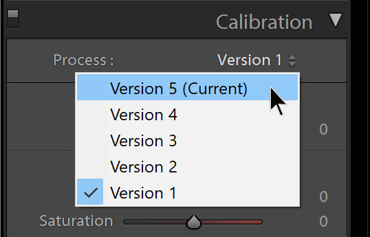
Here’s just one example, a picture I took when initially testing out the M9 in Germany in 2009. The first image was simply exported from Lightroom using all my original settings from 11 years ago, with legacy camera profile and process version. The second image was brought up to current standards by applying my 2020 M9 preset, then fine-tuning the file to taste. Besides the overall balance of colors behaving much more normally, there is also a lot of new detail in the previously blown-out red channel of the roses.
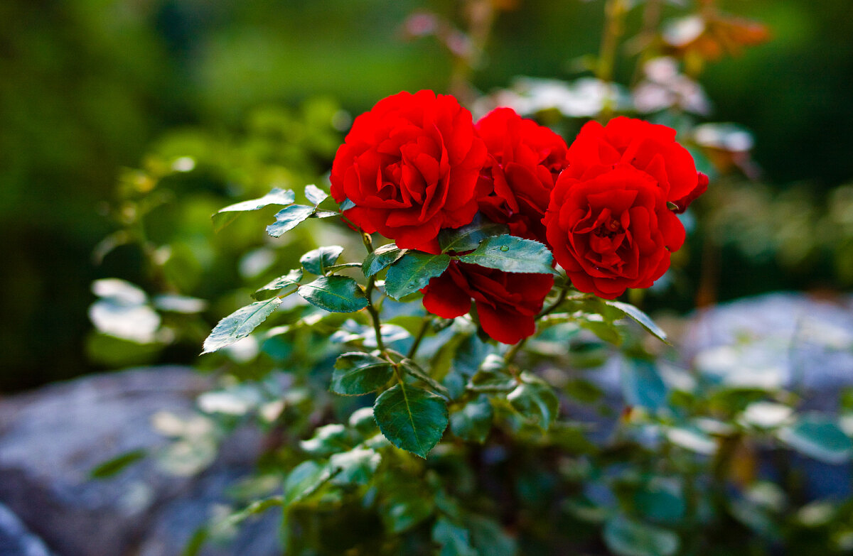
Original 2009 Leica M9 processing with Embedded profile and Version 1 Process
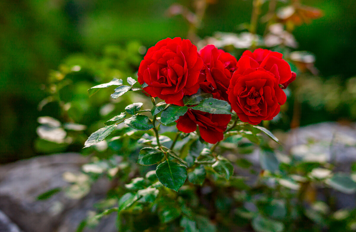
Updated 2020 Leica M9 processing with Adobe Standard and Version 5 Process
My approach here is to reevaluate pictures on a case-by-case basis as I need them for projects or prints. Otherwise, I’d go insane and spend all my time reprocessing years’ worth of photography. Of course, what you chose to do with these presets with updated processing is entirely up to you. Just be warned that you might start to see potential in previously discarded shots, and that rabbit hole goes deep. The good news? That mystical promise that shooting in RAW will allow you the potential to use better processing algorithms in the future and that your files will get better with age – turns out to be true here in the future. So, pat your 2010 self on the back for doing the right thing and shooting in RAW.
For other articles on this blog please click on Blog Archive in the column to the right
For other articles on this blog please click on Blog Archive in the column to the right
To comment or to read comments please scroll past the ads below.
All ads present items of interest to Leica owners.
_______________________________________________________________________
To comment or to read comments please scroll past the ads below.
All ads present items of interest to Leica owners.
_______________________________________________________________________


 Buy vintage Leica cameras from America's premier Leica specialist
 http://www.tamarkin.com/leicagallery/upcoming-show

Buy vintage Leica cameras from
America's premier Leica specialist
http://www.tamarkin.com/leicagallery/upcoming-show
Click on image to enlar Order: info@gmpphoto.comPlease make payment via PayPal to GMP Photography
Click on image to enlarge Order: info@gmpphoto.com
 Order: info@gmpphoto.com
Click on image to enlar
Order: info@gmpphoto.com
Please make payment via PayPal to GMP Photography
Click on image to enlarge
Order: info@gmpphoto.com
Please make payment via PayPal to GMP Photography
Click on image to enlarge
Order: info@gmpphoto.com
Please make payment via PayPal to GMP Photography