Wednesday, March 29, 2017

NEW LENSES FROM LEICA


Many Leica owners are probably unaware of the fact that the Leica cameras owe their existence to the motion picture industry.  Oskar Barnack’s first camera design was a motion picture camera, shortly after he began work at the Ernst Leitz company in Wetzlar.  It was based on the results he obtained from an exposure testing device for that camera that he decided to design the Ur-Leica, the original prototype Leica, and the rest is history, as they say.

Thus it should come as no surprise that Leica is involved with the motion picture industry even today.  Their sister company CW Sonderoptic, also based at Leitz Park II in Wertzlar, is making lenses for motion picture cameras which by many are considered the best in the business.  Many of these lenses can be adapted for use on Leica still cameras like the Leica M and Leica SL as well.

Responding to the increasing need for character-driven, large-format optics, CW Sonderoptic introduced the Leica Thalia series of prime lenses. The set of 9 spherical lenses provides an image circle of 60mm diagonal, which covers ARRI Alexa 65, VistaVision, and Super 35 film and digital formats while maintaining a consistent look and feel through all focal lengths.


Although the lenses are based on the Leica S medium format lenses, they feature significant optical and mechanical changes, including: increased image circle, new coatings, new iris design, 270° rotation cam focus mechanism, and entirely new mechanics and housings. Additionally, the 55mm lens is a completely new lens.


One of the most unique features of the Leica Thalia lenses is their iris design, which maintains a circular shape through the entire aperture range. In addition to always being round, the bokeh is smooth, distinct and full of character, which helps the out of focus elements maintain structure and shape without falling apart.

Images captured with the Leica Thalia lenses can appear to have an added depth and dimensionality, especially on larger sensors, due to a gradual focus fall off curve. Rather than even, flat layers of focus across the frame, the Thalia lenses have a slight curve that can make an image “pop” because it is simultaneously more consistent with human vision and yet different from most images created with modern lenses.


The focal lengths of the lenses include 24, 30, 35, 45, 55, 70, 100, 120, and 180mm. The lenses are available in PL mount and offer /i Technology metadata contacts in the mount. The lenses maintain a 95mm front diameter and matched focus and iris ring locations for consistent accessory use. For large format lenses they are also incredibly compact and lightweight, with lengths between 4.9”-6.9” (124.5-175cm) and weighing between 2.4-3.75lbs (1.06-1.6kg).

The Leica Thalia lenses will be on display at the CW Sonderoptic booth at NAB (C4345) and will start delivering in Summer 2017.


For more information visit the product page at www.cw-sonderoptic.com/leica-thalia/ or contact us at sales@cw-sonderoptic.de.


For other articles on this blog scroll down in the column to the right to BLOG ARCHIVE


___________________________________________________________________________


To comment or to read comments please scroll past the ads below.
All ads present items of interest to Leica owners.


www.classicconnection.com                                     www.oberwerth.com


                                       www.eddycam.com                                       


Buy vintage Leica cameras from 
America's premier Leica specialist 


 http://www.tamarkinauctions.com/            http://www.tamarkin.com/leicagallery/upcoming-shows


Click on image to enlarge
Please make payment via PayPal to GMP Photography

Click on image to enlarge
Please make payment via PayPal to GMP Photography

Click on image to enlarge
Please make payment via PayPal to GMP Photography


Tuesday, March 28, 2017

COMPOSITION


Many camera owners take advantage of social media to show off their photographic endeavors, unfortunately often with rather questionable results.  Too many people foll themselves in believing that today’s auto everything cameras are foolproof and therefore don’t require any nominal knowledge of photography.  Nothing could be further from the truth, and the result is that far too often we see pictures with the wrong color balance, with total lack of tonality, wrong exposure settings and poor composition.

Volumes have been written about the topic of composition and probably without exception, it is always mentioned that there are really no rules that are carved in stone.  What we do have is a number of guidelines, all designed to help us create better pictures.  However, these should not be looked upon as a replacement for visually evaluating whatever we try to photograph.  What we see in the viewfinder of our cameras remains as important as ever.  One piece of advice that I always give is “if it looks good, shoot it.”

Some individuals intuitively use good composition and end up with good pictures.  For them the guidelines of composition will turn into an explanation of why their pictures look good.  For the majority, however, these guidelines will help to create better pictures by simply evaluating what is seen in the viewfinder, applying some of these guidelines and thus end up with better pictures than what otherwise might have been the case.

It is not the purpose of this article to touch on each and every one of these rules.  Instead I will concentrate on just the most important ones in order to keep this from getting too tedious.

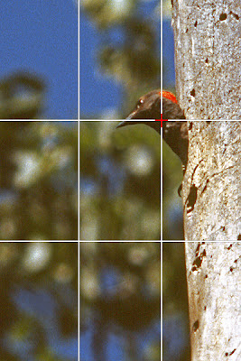
Of all these guidelines, without question the most useful one is the rule of thirds.  Here we divide the image seen in the viewfinder by two evenly spaced vertical and horizontal lines.  This will help composition in a variety of ways.  Not only does it lead to better placement of the main object of the picture, it also suggests better placement of the horizon as well as placement of other important aspects of the picture.


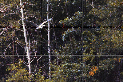
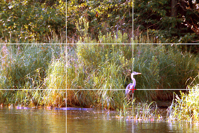
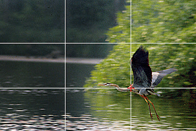
In these four examples I used the rule of thirds by placing the main subject onto one of the four areas where the horizontal and vertical lines intersect.  Especial with cameras where the autofocus sensor is in the center of the viewfinder, it is almost intuitive to place the main subject in the center.  That usually has the result of the picture looking somewhat static.  Applying the rule of thirds usually will lead to a noticeable improvement of the picture.

Of course, this brings up the question which of the four intersection point to place the subject on.  In the first example, the upper left intersection point is most advantageous in order to emphasize the height of the flying bird.  In addition, it is usually better to place a moving subject such that it appears to be moving into the picture, with space in front to move towards.

For the second example there is no clear advantage of one over the other.  Here it is simply a matter of what one feels looks best.

The third example is similar to the first one, again leaving room in front of the bird to move towards.  I chose the lower right intersection point since the bird just took off, flying low across the surface of the water.

The fourth example was taken from a low vantage point, leading to an upward camera angle.  Therefore the picture looks better with the bird up high in the picture with space in front of the bird.  The upper right intersecting point is the best choice in this case.


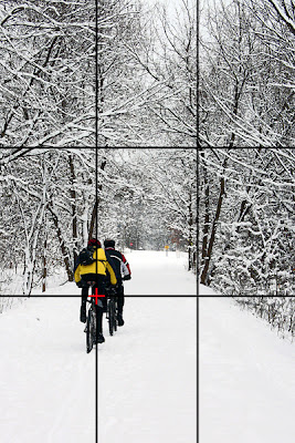
Another aspect of good composition is lines and diagonals.  They help to lead the eye toward the subject and into the picture.  The path in this photograph shows strong lines.  The main subject was best placed on the lower left intersection point because this way the lines lead to the impression of the bikers moving forward and into the picture.


Even though placing the subject into the center of the picture usually will lead to a static looking image, there are times when this is actually advantageous, as in this case.  The picture contains some very strong lines which all lead the eye toward the main subject.  Utilizing these lines actually made for a better picture by placing the subject into the center.

Another aspect of the composition of this picture is the cropping.  Some photographs simply look better when cropped from the typical format of the camera.  The horizontal emphasis of this picture by cropping the top and the bottom further enhance the subject position within the picture.


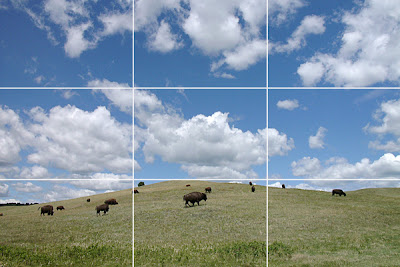
The horizontal and vertical lines of the rule of thirds also give an indication of proper placement of strong verticals or horizontals within the picture, like the horizon in this case.  The lower horizontal is advantageous because it not only eliminated empty grass space in front of the buffaloes it also allowed to take advantage of the marvelous clouds and blue sky.


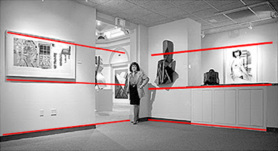
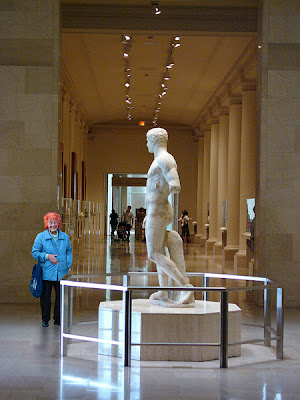
This example combines several aspects of good composition.  The strong diagonal lines of the background lead to the main subject, the statue, in the center.  In addition, the columns create a strong pattern which is another element of composition.  Finally, the lady viewing the statue creates a second important viewpoint of the picture.  The placement on the lower left intersecting point very much adds to the composition, as do the strong colors in the otherwise subdued colors of the picture, especially the bright, red hair.


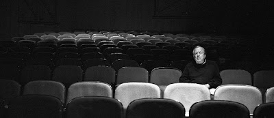
This is another example of strong subject placement, in this case on the right vertical line.  The picture would have had a lot less impact had the subject been placed in the center.  In addition the picture is further enhanced by the cropping and the pattern of the seats in both the foreground and especially the background.


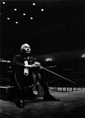
Placing the subject on the lower left intersecting point emphasized the upward camera angle without allowing it to appear distant as it would have been the case had it been placed on the upper left intersection point.  In addition, the mostly black background creates a lot of so called dead space.  This is often preferable over background detail which would be distracting.  Finally, the violin bow is a strong line, leading to the main subject of the picture.


Color can be another important element of a photograph as in this example.  While the colors are not an element of composition on their own, they have a great impact in this example by being placed prominently in the center, surrounded by the muted colors of the shadows and by creating a very strong diagonal.


Diagonals are especially effective when they combine to triangles as in this photograph.  But it is important that these remain natural.  trying too hard to create diagonals and even more so triangles can easily lead to contrived looking pictures.


Framing can be used to emphasize the main subject of a photograph.  In the first example, the dark arch draws the eye immediately to the main subject, the street scene.  Similarly, the trees in the second example achieve the same result.


In portraits it is generally preferable to have more space in front of the face than in back.  Choosing to place the subject in the left vertical of the rule of thirds assured proper subject placement in this case.


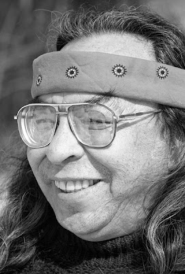
There are, however, times when the rule of thirds does not apply, as in this case.  The strong face of the person in this picture was emphasized by the close up of it.  Since it fills the entire frame, there was no other choice than to center it.  Anything else would have been distracting.


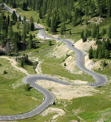
Another element of good composition is curves or s-lines.  As in this example, they are an interesting element of the picture that helps to lead the eye into the picture.


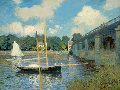
Of course, these elements of good composition don’t apply just to photography.  They have been applied by the great masters for years, just as in this case of the painting “The Bridge at Argenteuil” by Claude Monet.  It contains numerous elements of good composition.   The bridge shows several strong lines, including a pattern created by the upright pillars and it also leads the eye toward the background.    The sailboat in the foreground is placed in the lower left intersection point of the rule of thirds.  The mast, the boom and the bowsprit of the boat also form very strong lines.  The combination of all these elements of good composition ultimately make for a very interesting picture.

There are certainly additional rules of composition.  As mentioned above, to keep this article from becoming too long and possibly too confusing, I tried to concentrate on the most useful ones here.  Applying these when possible or warranted will lead to better pictures and over time, photographers will get used to it to the extent that these rules and their application will become second nature.  At that point, we have bridged the difference between just taking pictures and creating photographs.


For other articles on this blog scroll down in the column to the right to BLOG ARCHIVE


___________________________________________________________________________


To comment or to read comments please scroll past the ads below.
All ads present items of interest to Leica owners.


 
www.classicconnection.com                                     www.oberwerth.com


                                       www.eddycam.com                                       


Buy vintage Leica cameras from 
America's premier Leica specialist 


 http://www.tamarkinauctions.com/            http://www.tamarkin.com/leicagallery/upcoming-shows


Click on image to enlarge
Please make payment via PayPal to GMP Photography

Click on image to enlarge
Please make payment via PayPal to GMP Photography

Click on image to enlarge
Please make payment via PayPal to GMP Photography