Photoshop was created in
1988 and entered the market in 1990. But
even now, 28 years later, it still remains a questionable tool for many
photographers. Especially many of those
who still work analog consider Photoshop a crutch to hide mistakes. On the other hand, Photoshop has a loyal
following of those who consider Photoshop a worthwhile tool to perfect ones
photographs, analog and digital alike.
Of course Photoshop goes way beyond simple image manipulation; many use
it as an artistic tool to create pieces of art that otherwise would be very
difficult to achieve at best.
To use Photoshop
effectively, it is necessary to overcome a relatively large learning
curve. I have been asked quite often
about other, none Photoshop related ways, to create photographs that stand out
because they are different. Of course there are a myriad of ways and means to
do so. Here are a few that are
relatively easy to achieve.
One of the easiest is done
without any accessories or other forms of trickery. It is simply a matter of using slow shutter
speeds to create images that have a definitely different look.
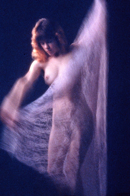
This image of Cindy was
done with ordinary studio lighting, simply using a shutter speed of 1
second. For the fluent pose, I simply
had Cidy dance to the background music in the studio. Needless to say, many of the results were
useless for one reason or another. But
this is a good example of what can be done in this manner.
Another possibility for a
huge number of different approaches is with modified lighting. Many studio light sources offer relatively
simple projection attachments which allow projecting of a wide choice of
various patterns.
Here I used a simple pattern
of light and dark stripes as the main light source, making sure that Melissa,
the model, was partially covered by both light and dark stripes. In this case it was also important that her
face was lit properly. In addition, I
had her strike a pose which partially followed the direction of the pattern of
the light
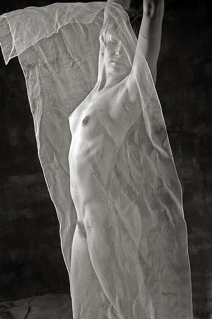
Another very useful
accessory is a sheer piece of material.
I wanted Melissa to be very much covered by the material, such that her
image was actually seen through the material.
However, just hanging it proved to be quite underwhelming. Instead I had her hold it with the fingertips
of both hands, asking her to toss it up into the air, taking the shot once the
material began floating down to the floor.
This image is the result of many tries, which proved to be by far the
best one.
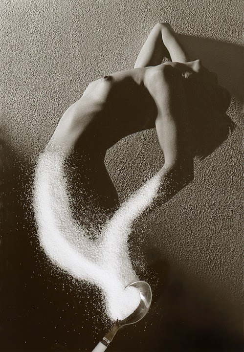
During the same shoot, I
also had Melissa strike a variety of different poses with different lighting
which I planned to use at a later date.
For one of these poses I had her leaning back as far as possible, using
hard lighting as the main light source.
I had her standing close to a textured wall, which resulted not only in
the texture showing up quite well and thus becoming part of the total image,
but it also created a diagonal shadow of her in the top part of the
picture. I later used this picture for
an idea that had come to me a while prior to this shoot.

For this I made an 11 x 14
enlargement with the image right and left reversed, making sure to burn in the
bottom left diagonal section to be mostly black. Once finished, I put it on a flat surface
put in the spoon and covered the outline of the bottom part of the body and the
spoon with sugar, after which I simply copied the image to render this rather
unusual looking photograph.
Another, relatively simple
means to create quite different looking photographs is the Polaroid Transfer
process. For those not familiar with
this, it is necessary to use the old style Polaroid peel-apart film, and it
must be color. The black and film will
not work for this. Once the film is
exposed, instead of waiting the recommended time before peeling the film apart,
it is necessary to do so after about 15 seconds. Then you discard the part which would
normally be the actual picture. Instead
you use the “throw-away” portion and put it into contact with another type of
receptor sheet, usually by using a rubber roller. Watercolor paper has proven to work very
well.
These Polaroid images are
created by a dye transfer process. In
this case, the dyes are transferred to the watercolor paper in about the same
time it takes for a regular Polaroid picture to “develop.” That by itself can create some very
interesting photos.
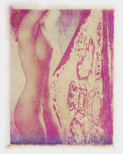
In this case I went one
step further. After the image had
transferred to the watercolor paper, I used running water and a soft brush to
remove the transferred dye gel of the image before it had a chance to dry. What remains on the paper after that is a stain
from the transferred dyes which makes for a striking image which has more the
look of a painting than that of an actual photograph.
Calumet photographic used
to sell an accessory material which they referred to as Chameleon Cloth. It was of the same size as regular, large
background materials. It was grey and
had a texture very similar to a clothes dryer sheet. The Chameleon Cloth was quite sheer and
definitely translucent. Of course it
could be used as a regular, wrinkled background. But it really came into its own when put
between the model and the camera, shooting through it. This created a texture covering the entire
photograph. This texture could be
further modified by varying depth of field, from relatively soft to sharp and
in focus.
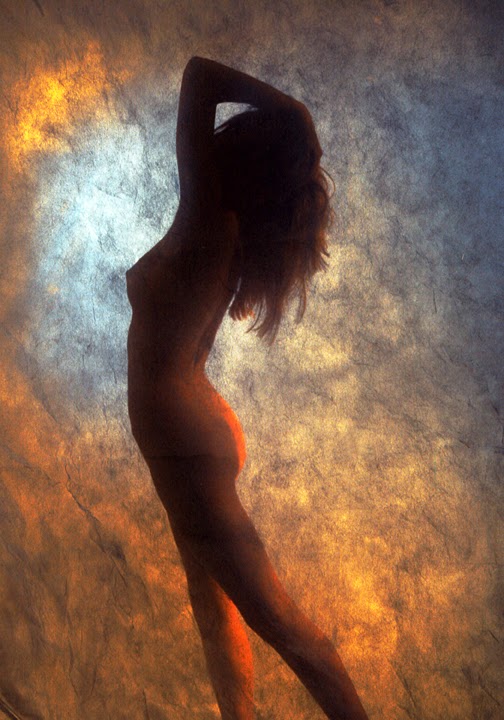
Here I mainly lit the
background with various colors, rendering Kallie mostly as a silhouette. Using a relatively wide aperture rendered the
texture pleasingly soft for this image.
Here is another example of
photographing Kallie through the Chameleon Cloth with the added effect of using
a smoke machine.
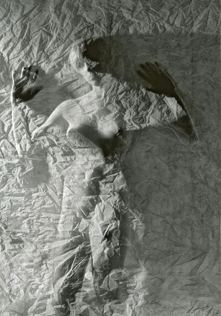
The final example of using
a Chameleon Cloth is this picture of Melissa.
I used strong side lighting and had her stand very close to the
Chameleon Cloth, partially touching it.
This created an almost surrealistic image, fading from the recognizable
image of Melissa, with the overlying texture of the Chameleon Cloth to just
texture. The strong shadows where
Melissa touched the cloth are definitely an added aspect of the appeal of this
photograph.
This enlargement was a bit more involved. I posed Cindy on a cloth draped box as shown. Instead of developing the enlargement normally, I brushed on the developer without immersing the paper into the developer. This gives a fair amount of control over the final look of the enlargement. After washing and drying, I contact printed the result with another piece of photographic paper. The developed image is a negative of the original, brush developed enlargement.
These examples show that
it isn’t necessary, even these days, to use Photoshop to come up with something
different. All that is needed is some
imagination, a few accessories and follow through.
For any questions, please feel free to ask.
________________________________________________________________________________________
To comment or to read comments please scroll past the ads below.
All ads present items of interest to Leica owners.


To comment or to read comments please scroll past the ads below.


All ads present items of interest to Leica owners.


For more information on KOMARU and for orders go to: www.taos-photographic.com
NEW Komaru Colors
For more information and pre orders go to: www.lenstab.com
For more information on KOMARU and for orders go to: www.taos-photographic.com
NEW Komaru Colors
For more information and pre orders go to: www.lenstab.com
Click on image to enlarge
Order: info@gmpphoto.com
Click on image to enlarge
Order: info@gmpphoto.com
Click on image to enlarge
Order: info@gmpphoto.com
Click on image to enlarge
Order: info@gmpphoto.com
Please make payment via PayPal to GMP Photography
Click on image to enlarge
Order: info@gmpphoto.com
Please make payment via PayPal to GMP Photography
Click on image to enlarge
Order: info@gmpphoto.com
Please make payment via PayPal to GMP Photography


No comments:
Post a Comment