By Josh Lehrer, LeicaStore Miami
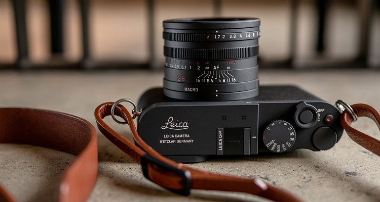
When Leica launched their latest variant of the Q: the Leica Q-P, it was the first time that their legendary “P” designation had been applied to a fixed-lens camera. Expectations are high whenever a new “P” model is launched, and given the Q’s immense popularity since it was announced in June of 2015, this particular release was no exception.
While simple enough to read through the launch material and check out the official product photos (which we posted about here: Leica Q-P in Stealth Matte Black Released), I wanted to dive a bit deeper into the Q-P to really see what makes this camera special. If you’re not familiar with the Q (which the Q-P shares all other functions and features with) you can check out our in-depth review here: LeicaQ (Typ 116) Review: A Full-Frame Mini M.
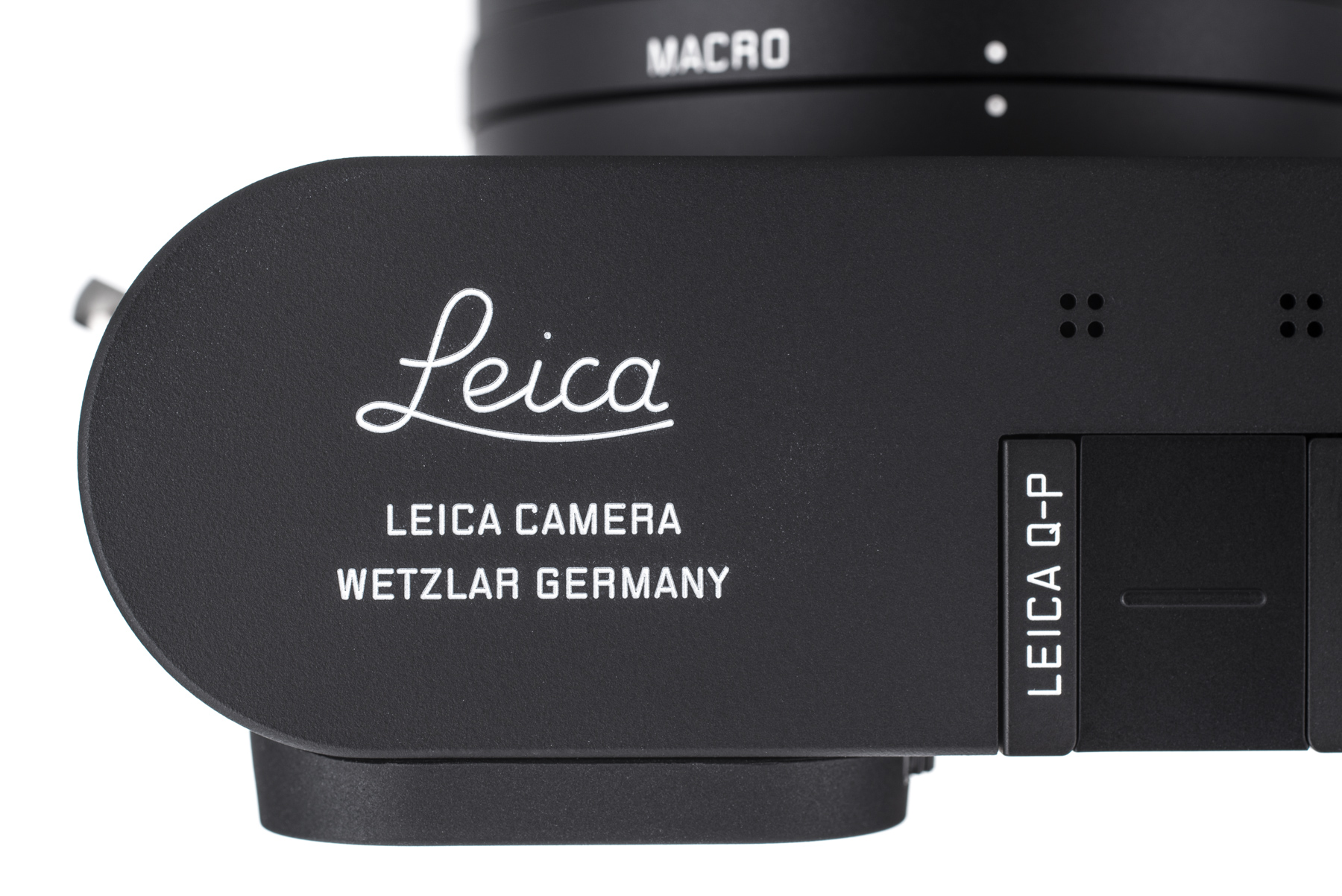
It’s hard to show just how different the finish is on the Q-P from other Leica cameras.
In this close-up you can just make out the slight texture in the paint.
In this close-up you can just make out the slight texture in the paint.
Fortunately, I was able to get my hands on a Leica Q-P, no small feat given their relative rarity, and now I can see what it’s all about. Let’s get the obvious out of the way first. The Q-P is more expensive than the Q. $500 more to be precise ($4,995 versus $4,495 as of this writing). What exactly are you getting for your $500? Leica throws in a spare battery with the Q-P, which retails alone for $95. You also get a lovely brown leather Leica neck strap, which is actually unique to the Q-P but similar straps have sold for about $125 from Leica in the past. Now the price gap between the Leica Q-P and the Q has narrowed to $280.
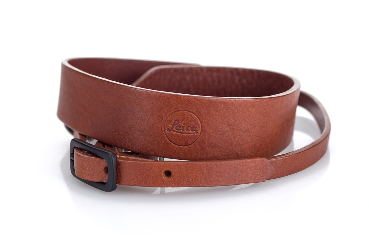
The brown leather strap included with the camera is quite nice, and is exclusive to the Leica Q-P (you can’t buy it on its own).
It’s adjustable from 41-44 inches.
It’s adjustable from 41-44 inches.
The Paint
The major new “feature” for the Q-P is the matte black finish. It’s actually quite challenging to show the finish properly in photographs. Especially because it has a very subtle, but noticeable, texture to it that really needs to be experienced firsthand. When the Q-P was launched, we immediately drew a comparison to another special edition Leica, the M Monochrom “Stealth Edition” which also sported this matte black paint. But now that I have both cameras side by side (thanks to a very generous Leica enthusiast willing to share), it’s actually interesting to see that the finish on the Q-P is even more matte than the Stealth Edition. I’m not sure if this is because the finish itself is different, or because the Q-P’s body is made from different material, but the finish on the Q-P is the most matte finish I’ve ever seen on any Leica model. It barely reflects any light, especially compared to other finishes.
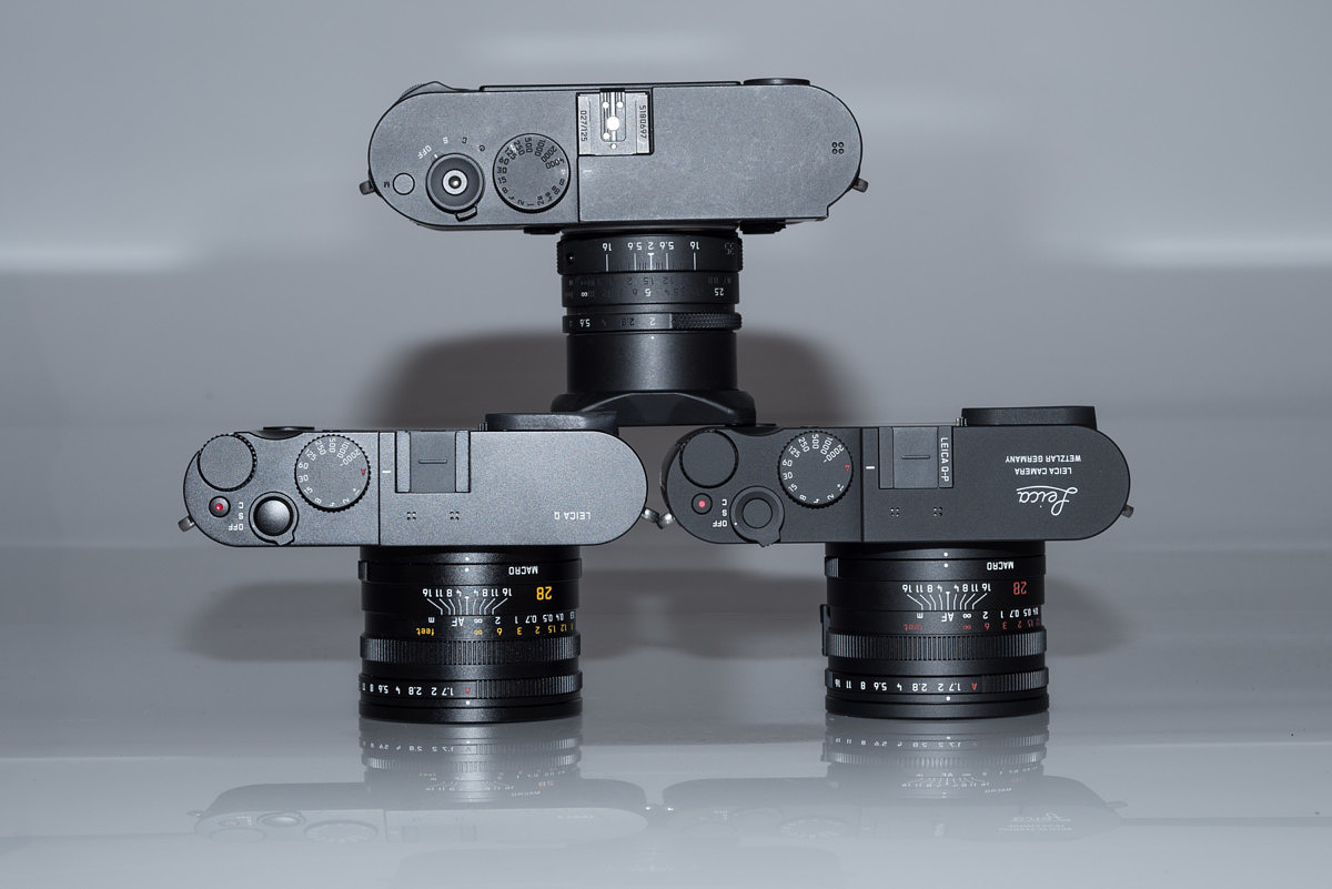
This photo may be ugly, but using a direct, on-camera flash you can clearly see just how matte the finish on the Q-P (bottom-right) is.
On top is the Monochrom Stealth Edition, and bottom-left is the regular Q.
On top is the Monochrom Stealth Edition, and bottom-left is the regular Q.
And for a real Leica geek like myself, an exciting part of this new finish is that, of course, the Q-P’s lens hood and lens cap are in the same matte paint as the camera body. These parts are available to purchase separately if you want to add a bit of matte finish to your regular Q. Sadly, the hot shoe cover has not been changed from the Q.
Other Key Improvements
New finish aside, the major functional change for the Q-P is a redesigned power switch and shutter button assembly. It’s no secret that on the regular Q and its variations, the low-profile nature of the power switch made it a bit tricky to change between OFF, S and C (especially when you’re not looking at the camera). The Leica Q-P’s switch is 50% taller (3mm on the Q versus 4.5mm on the Q-P) and 10% wider (17.3mm versus 15.7mm). I knew there was a reason I kept a micrometer in my desk drawer!
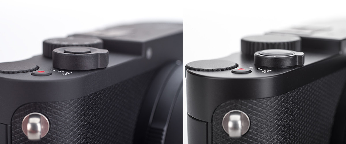
The power switch on the Q-P has been dramatically improved with a 50% height increase.
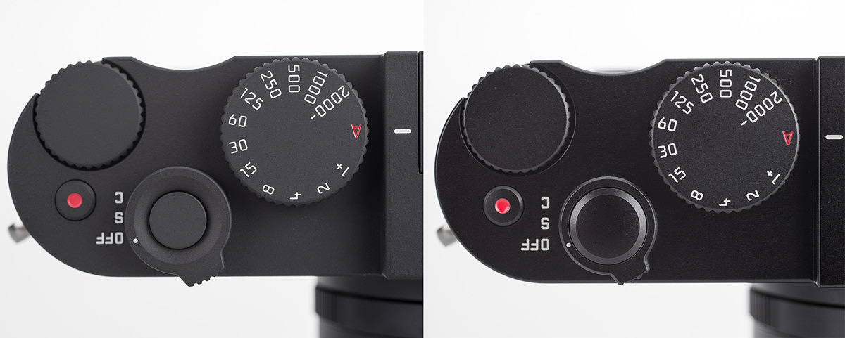
The redesigned Q-P shutter button will be familiar to M10 and CL shooters.
In this photo the 10% width increase of the switch is also clearly visible.
In this photo the 10% width increase of the switch is also clearly visible.
What you can’t easily tell from the official photos is that the end of the power switch on the Q-P actually sticks out just a bit over the edge of the camera body, whereas the switch on the Q sits flush. This small adjustment, combined with the taller and wider switch, makes it far easier to move the switch precisely between its three positions. It feels more like the power switch on the M10 or CL. There is not much I would change from the Q given the chance, but the power switch would be at the top of that short list. Thankfully, Leica brought this enhancement to the Q-P.
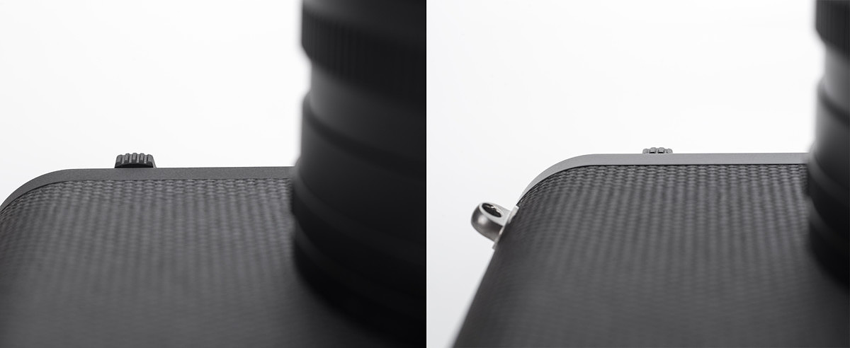
On the left you can see how the power switch of the Q-P sticks out just a bit further than the Q’s switch,
which makes it far easier to engage the desired position between OFF, S & C.
which makes it far easier to engage the desired position between OFF, S & C.
Classic “P” Styling Cues
Cosmetic changes beyond the matte paint are in line with what we would expect from a P model. Namely, the red Leica dot logo has been removed from the front of the camera, The LEICA Q designation on the top plate has been replaced with the classic Leica script logo, along with LEICA CAMERA WETZLAR GERMANY (which has been relocated here from the back of the regular Q), and the previously blank hot shoe carries the LEICA Q-P logo. The crisp white lettering on the top plate contrasts beautifully with the flat matte paint on the camera. A final classy touch is the yellow numbering on the lens has been changed to red.
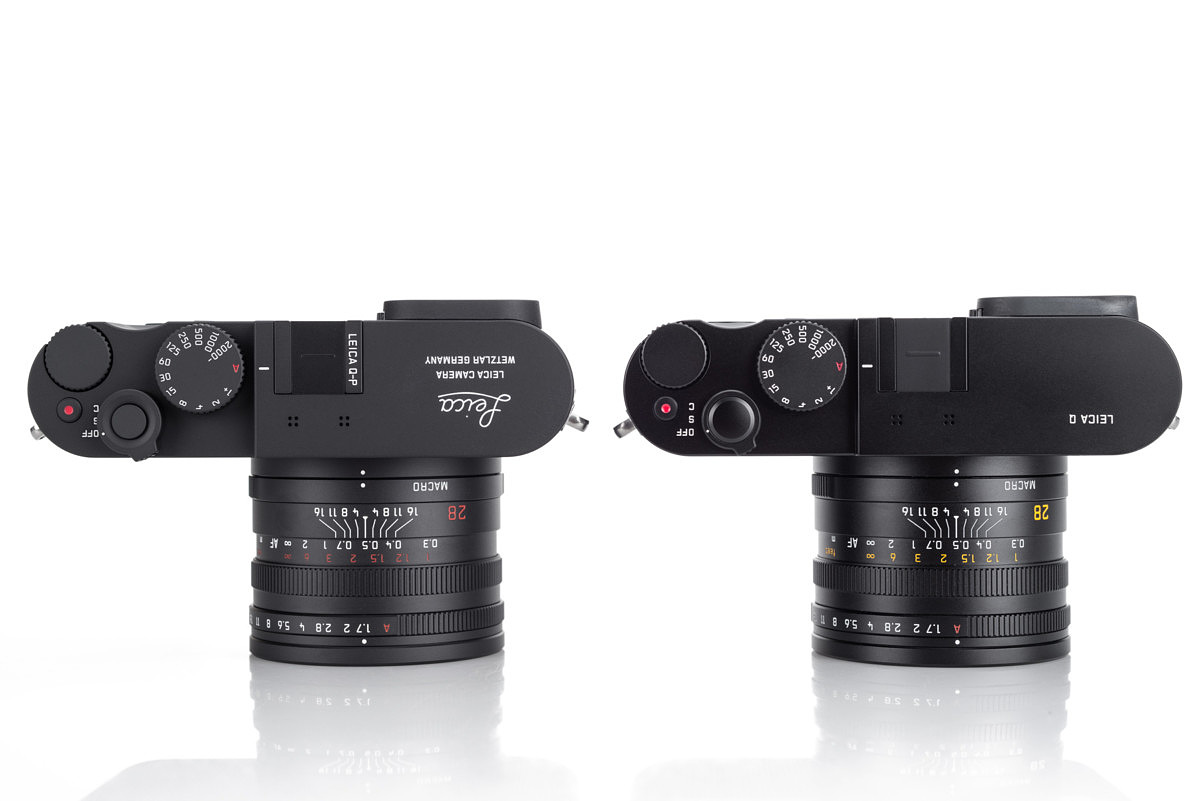
The Q-P has the classic Leica script logo on the top plate, along with branding on the hot shoe.
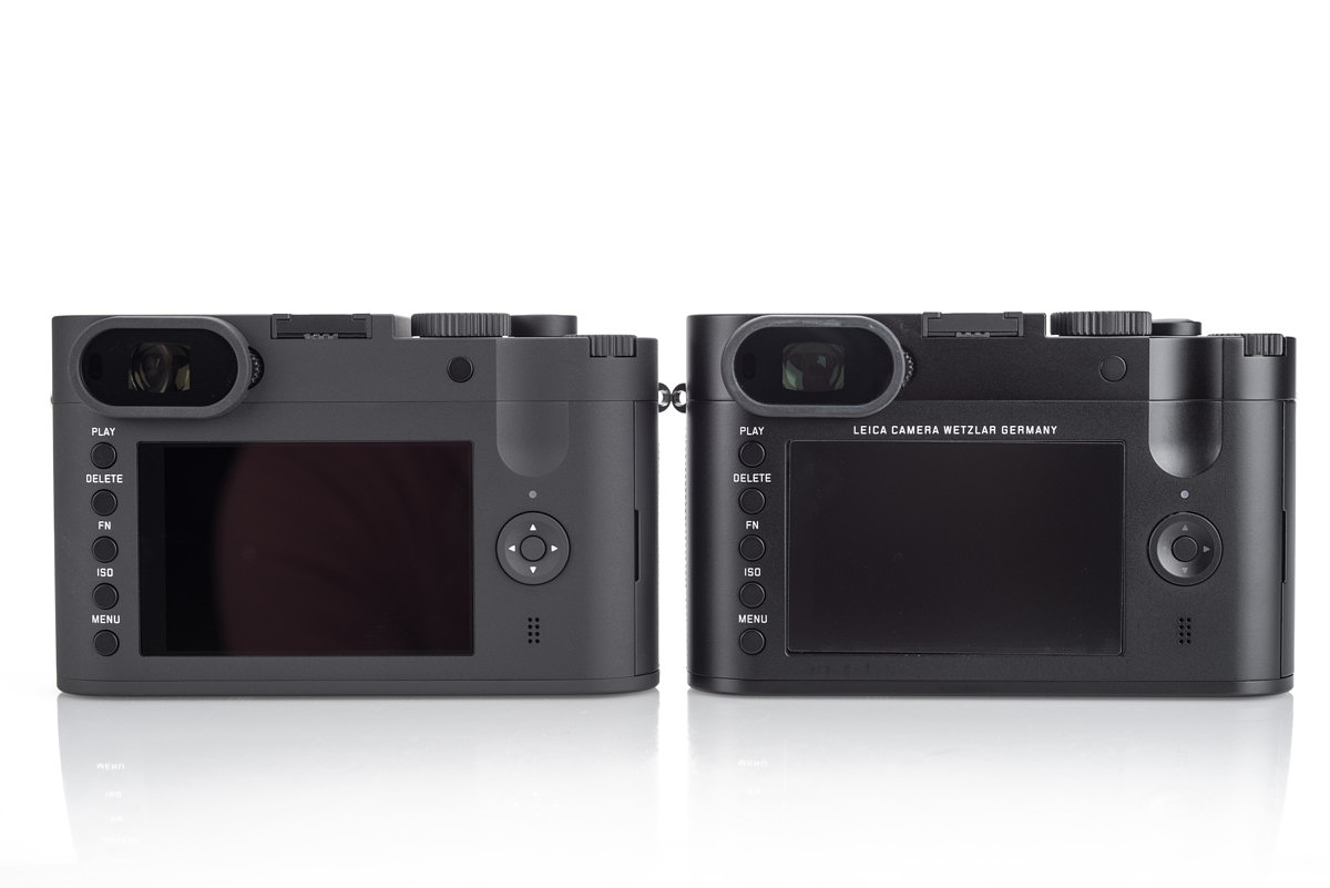
Previously located above the rear LCD, the LEICA CAMERA WETZLAR GERMANY text has been moved to the top of the Q-P,
giving the back of the camera more discreet appearance.
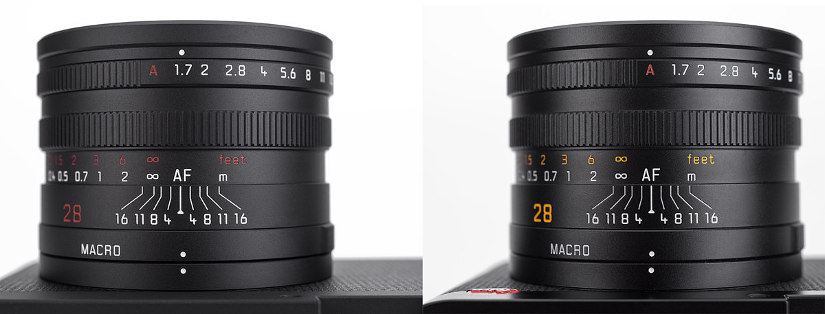
The feet distance scale and focal length indicator on the Q-P’s lens is now in red font, versus yellow on the Q.
The Value Question
The real question of course…is the Q-P worth the extra $500 over the regular Q? I think the obvious answer is yes, as long as you are a fan of the matte black finish. I realize that the classic “black paint” look has a lot of fans, but personally I like the discreet, slick look of the Q-P. This follows Leica’s trend of “black chrome” cameras (like the M10 and both versions of the Monochrom) which are also a matte black finish, but takes it a few steps further. The $500 premium over the standard Q is easy to justify, considering you are getting over $200 in additional accessories, plus the Q-P will certainly retain its value better than the Q, as it will inevitably be produced in considerably smaller numbers.
For other articles on this blog please click on Blog Archive in the column to the right
For other articles on this blog please click on Blog Archive in the column to the right
To comment or to read comments please scroll past the ads below.
All ads present items of interest to Leica owners.
_______________________________________________________________________
To comment or to read comments please scroll past the ads below.
All ads present items of interest to Leica owners.
_______________________________________________________________________
Buy vintage Leica cameras from America's premier Leica specialist
Buy vintage Leica cameras from
America's premier Leica specialist
Click on image to enlarge
Click on image to enlarge
Click on image to enlarge
Click on image to enlarge
Click on image to enlarge
Click on image to enlarge


