

A while back I got into a
discussion with a colleague regarding Photoshop. He was of the opinion that photographs should
be shown as they “come out of the camera.”
He totally rejected the idea to use Photoshop or similar software to
alter photographs in any way.
I totally disagree with
that. Unless anyone is satisfied what
our cameras can do all on their own, we must not lose track of why we take
pictures in the first place. Isn’t the
final photograph what counts in the end?
Photographers have
manipulated their images virtually since day one, and they have done so to
achieve better end results, to come up with the best photographs possible . The fact that Photoshop has made this often substantially
easier than in the analog days ultimately is irrelevant.
I fully embrace these new
digital “helpers” to the fullest extend because in many instances they have
actually helped me to obtain rather good photographs which otherwise might have
been mediocre at best or material for a waste basket in many instances.
Since manipulating analog
photographs in most cases was a lot more difficult and time consuming in the past, I learned
to previsualize what I would like my final results to look like, and then take
my photographs in a manner that minimizes additional work as much as possible. I continue to do that with my digital equipment just the same.
But that obviously is not
foolproof. Quite often I end up with
results that are not at all what I wanted them to be. While this often resulted in discarding such
an image, software like Photoshop, Lightroom etc. now allow me to make changes
that will lead to substantial improvements.
I like to refer to that as
a “picture in a picture”. Often even
simple cropping can result in a greatly improved photograph.

I didn't like this
photograph at all because of the hat protruding into the image area. Just slight cropping resulted in a
noticeable improvement. All I did was eliminate part of the bottom of the photograph. Not only did it reduce the impact of the hat, it also resulted in a more panorama like view, still showing a typical Venice scene.

Once I took a closer look,
I saw the possibility of additional images, some that at first glance totally eluded
me. Further cropping resulted in a much
less touristy photo, still showing a Venice scene, but with definite emphasis
on the people in the foreground.


One more crop resulted in
the final image of just the couple.
Three different photographs out of one and the same shot, and all better
than what initially came out of the camera.

Here is a situation where
all the previsualzing was of no help. I
was on the other side of the canal and had no way to get closer to the
scene. The result was a rather poor
photograph with too much foreground and hardly any emphasis on what I saw as a
good photo opportunity. Once again simple cropping allowed me to get the result I was after in the fist place.

This is another example of
the initial photograph being not much more than a typical tourist shot. Once more, careful cropping and attention to color correction allowed to place
much more emphasis on the people in the gondola within a tranquil, off-the-beaten-path area in Venice.


In popular, well known
places like Venice it is easy to take pictures like we have seen countless
times in the past. I tried to avoid that
as much as possible. Subsequently a
major part of my time there was spent at out of the way places. Not only did I see parts of Venice we usually
don’t find in brochures and advertisings, it also gave me the opportunity to
show Venice in an entirely different light (no pun intended).
As I have shown, while
simple cropping can definitely result in better photographs, there is of course
more. I personally like black and white
very much. It allows me to create
photographs that often have a lot more impact than their counterparts in color. But black and white is definitely harder to
work with. It usually requires more than
just pressing a button to go from a color file to black and white.
I consider myself lucky
that I gained a lot of experience printing black and white in an analog
darkroom. That helps me even today
because I approach a black and white digital print virtually in the same manner
as I did during the analog days.

Acceptable in color...

...but so much more impactful in black and white
I don’t make the decision
of color or black and white before. I
shoot everything in color, for no other reason that it gives me a choice later
on when I work with my files. Once I
decide on black and white, I initially make a simple black and white conversion
in Photoshop. After that I give the
image a slightly warm tone, simply because I like it better.
I then evaluate the image
in terms if density, contrast and overall tonal range. That can easily include dodging and burning certain
areas, or adjusting the image by making only certain areas lighter or darker.
One thing to keep in mind
here that we are talking black and white, not just dark grey and white. But that doesn’t mean that some of the dark
areas should go totally black or the opposite in the highlight areas. I try to maintain as much detail as possible
in the shadows as well as the highlights.
Here are some more specific examples of what I do to achieve good black and white results.
As I mentioned already, I do shoot all of my photographs in color although a Leica Monochrom just will not disappear from my wish list. The reason is that quite often I come across photographic opportunities that lend themselves equally well to be in color as well as black and white. Thus I prefer to make that final decision when looking at the results on my monitor.
I am aware of the advantages of shooting RAW and for very important jobs I certainly do so. I feel my clients deserve that. But for myself, I have no problem shooting JPEG files, however, always with the least amount of compression. After a simple conversion to black and white in Photoshop, I save the black and white image as a separate file. This allows me to compare both side by side before making the final decision of color or black and white.

Actually this images works quire well in color,
but I think the final black and white version is even better.
Once I have a file that I want to be in black and white I make the conversion in Photoshop and save the file as BW. I make no further changes before opening the image in “Bridge.” A right click on the chosen image allows opening the file in “Camera Raw” even if the original image is a JPEG file. That offers a huge amount of manipulations, beyond simple Photoshop.
The first thing I do is click on “White Balance” and switch from “As Shot” to “Auto”. That will switch the image to a very slight brown or sepia tone which I like better than the cold tones from the Photoshop black and white conversion.

Next are some initial “Exposure” or “Brightness” corrections if necessary. The same goes for “Contrast.” At this point the image should already show some definite improvements over the basic starter image, but further evaluation is usually necessary.

I always told my students that black and white means just that. If at all possible, our final prints should have a tonality from deep black to pure white. That by itself is not difficult to do. Simply increase contrast and you will definitely end up with black and with white. The trick is to adjust the blacks and whites, but also all tones in between in a manner that no detail is being lost. For this Bridge offers several possibilities:
Clicking on the “Tone Curve” symbol close to the top allows fine adjustments for “Highlights”, “Lights”, “Darks” and “Shadows.” How much of these adjustments are necessary is ultimately a judgment call. Be careful because these adjustments will influence the image as a whole. But when used correctly, it is definitely possible to get rich blacks in the shadows, blacks where only the very darkest areas a totally black, but areas just a bit lighter will maintain detail. The same is true for the highlights as well as the lights and darks. What is being done here is simply extending the tonal range of the photograph beyond what the camera was able to do on its own.

Next to the “Tonal Curve” symbols is “Sharpening” and “Noise Reduction.” This allows isolating especially fine detail from its background and, when shooting with relatively high ISO values, the resulting noise can be noticeably decreased. But care must be taken because noise reduction beyond a certain point will definitely lead to a loss in detail and sharpness.
At this point the final image should have emerged, or at least an image that is very close. Earlier I mentioned dodging and burning, a technique often used with analog printing. Digital printing is no different. It offers the same possibilities. When opening the image by clicking on “Open Image” at the bottom, the image will open in standard Photoshop. This offers additional adjustments. For instance, with the “Magic Wand” tool we can isolate the sky from the rest of the image and lighten or darken it, if necessary. If more precision is necessary, the “Lasso” tool or preferably the “Polygonal Lasso” tool will do the trick. The “Burn Tool” or the “Dodge Tool” can be used to make some final adjustments by allowing lightening or darkening of selected areas, down to very fine detail.

For the final image I used the dodge and burn tool to selectively lighten and darken small areas to
extend the tonal range of the image
The end result will be a photograph way beyond what originally came out of the camera. This is not altering the image beyond what the camera saw or what the camera was supposed to photograph, it is simply a means to show everything the camera recorded. We just make it all visible and by doing so end up with much better photographs.
Following are several
examples of photographs which were modified along the same guidelines.

Just because most of our cameras have a rectangular layout
doesn't mean that all of our photographs have to be that way as well.
I didn't like the heavy trees on the right ...
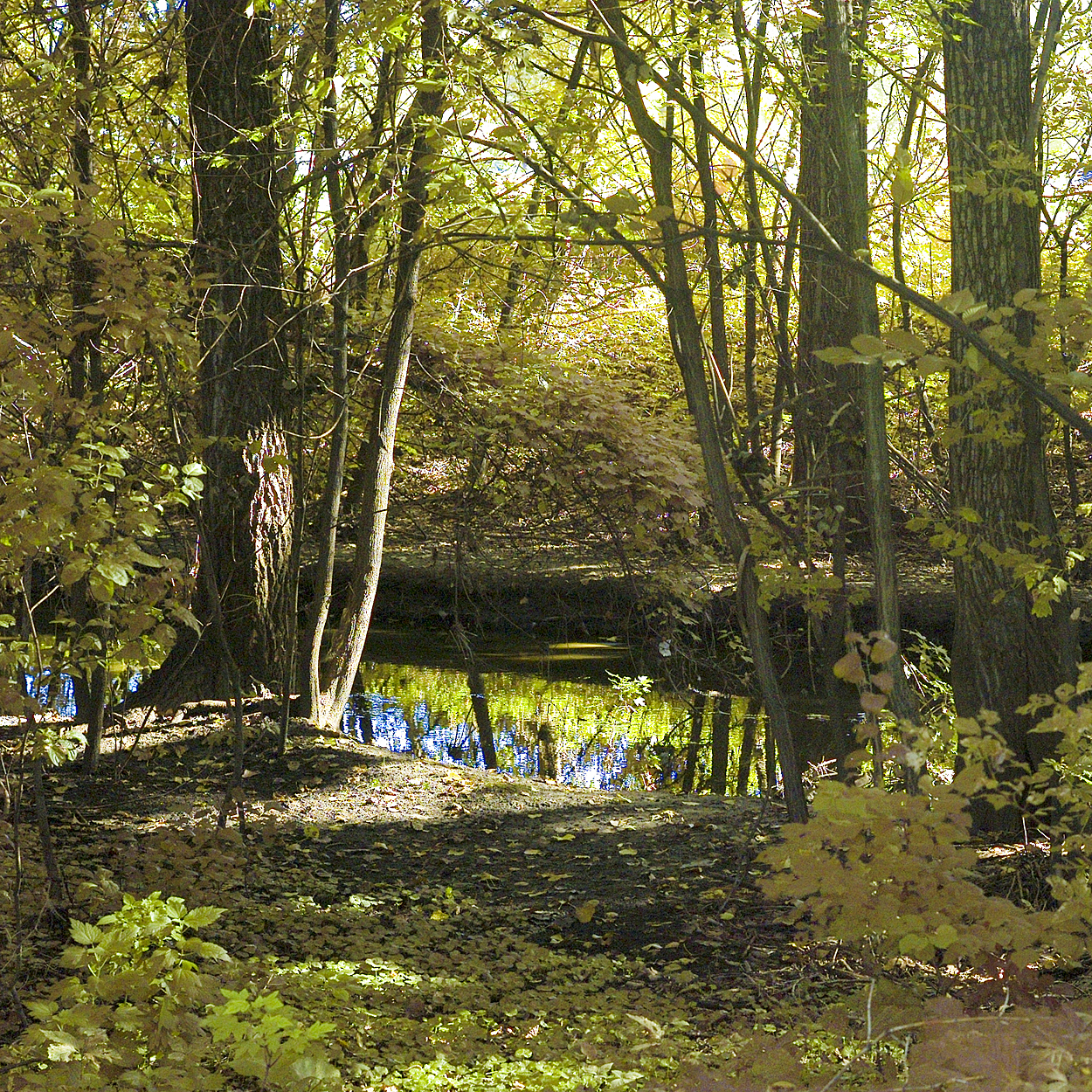
... By cropping them out I came up with a better, square photograph


These examples are all very good photographs, but cropping resulted in two different end results

I found the right side of this photograph distracting

Cropping made for a much better end result

This is a typical grab shot as we see them time and time again

Cropping ultimately resulted in a nice photograph of Lea
To comment or to read comments please scroll past the ads below.
All ads present items of interest to Leica owners.
___________________________________________________________________________
To comment or to read comments please scroll past the ads below.
All ads present items of interest to Leica owners.
___________________________________________________________________________


 Buy vintage Leica cameras from
America's premier Leica specialist
Buy vintage Leica cameras from
America's premier Leica specialist


Buy vintage Leica cameras from
America's premier Leica specialist


Click on image to enlarge

Order: info@gmpphoto.com
Please make payment via PayPal to GMP Photography
Click on image to enlarge
 Order: info@gmpphoto.com
Click on image to enlarge
 Order: info@gmpphoto.com
Click on image to enlarge

Order: info@gmpphoto.com
Please make payment via PayPal to GMP Photography
Click on image to enlarge

Order: info@gmpphoto.com
Please make payment via PayPal to GMP Photography
Click on image to enlarge

Order: info@gmpphoto.com
Please make payment via PayPal to GMP Photography
In the first two crop examples of the first image some of the hat is still visible.
ReplyDeleteYes, it is, but it has a lot less impact compared to the original. Of course another step would have been to remove it with Photoshop
ReplyDeleteIn the third Venice picture, there are some dark black areas which show no detail at all. Isn't that counter to what you wrote in the article about blacks?
ReplyDeletesomewhat more detail would have been preferable, but I can only show what the camera actually recorded. There was no detail in the original image, subsequently there is nothing that can be done to show any.
DeleteWouldn't have exposing more for the shadows helped?
DeleteYes, it would have as far as gaining some more detail in the dark areas goes. But that would have caused the loss of some detail in the highlight areas. As it is, I had to work quite a bit to maintain detail in the brightly lit buildings at the top center of the image.
Delete